Type One Climbs is a Los Angeles-based guiding company that helps people experience outdoor climbing safely and confidently. I partnered directly with Paul Reid, the founder and lead guide, as the sole UX and UI designer to improve the site’s booking experience and overall credibility.
My responsibilities included user research, information architecture, visual design, and usability testing.
The goal was to design a modern and trustworthy experience that made booking a climb feel as approachable as the climbs themselves.
TYPE ONE CLIMBS REDESIGN
Homepage


RESPONSIVE DESIGN


Finding the Route: Challenge
Despite strong interest and steady traffic, users hesitated to book guided climbs because the site felt outdated, unclear, and lacked the trust signals they needed to feel confident.
ORIGINAL DESIGN

Setting the Goal: Defining Success
Success would be measured by creating a smoother user journey that reduced confusion and increased engagement from new visitors.
The goal was to rebuild Type One Climbs into a beginner-friendly platform that feels safe, professional, and easy to book.
Focus Areas
Mapping the Path: Research & Insights
To understand why climbers hesitated to book online, I interviewed outdoor enthusiasts of all experience levels and analyzed other guiding sites to uncover what builds trust… and what breaks it.
Key Insights:
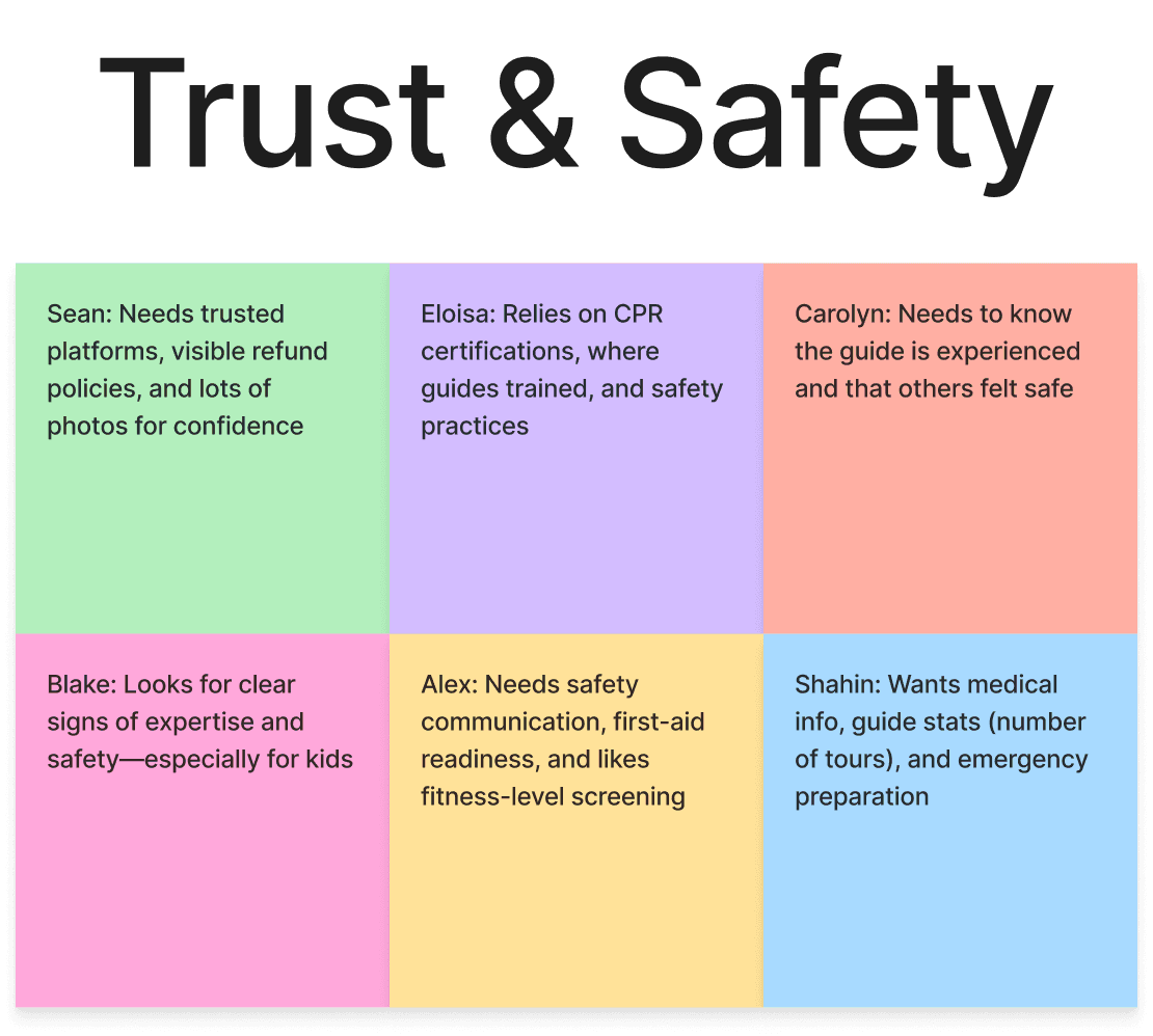
Clarity builds trust: Users wanted transparency about guides, safety, and what each climb included.
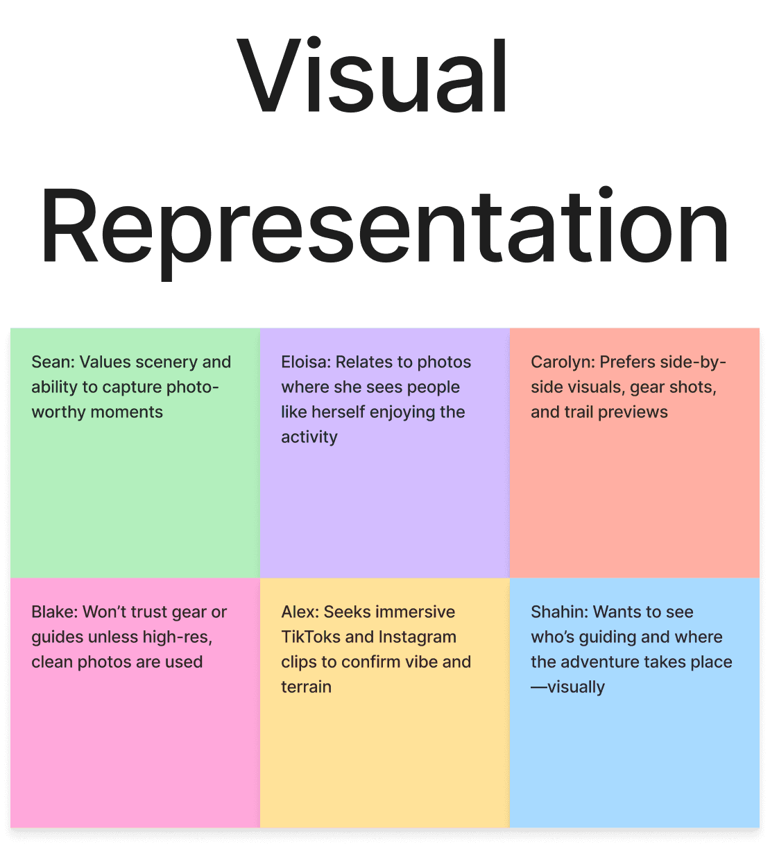
Visuals shape perception: Outdated imagery reduced trust, while professional visuals signaled safety and credibility.
Clear hierarchy builds confidence: Users preferred to browse climbs, meet guides, review logistics, and then book.
What This Meant for Design
The research confirmed the redesign should strengthen trust through clear structure, credible visuals, and transparent details.
Persona: Samantha Rivera
Outdoor enthusiast looking to try her first guided climb. She values safety, guidance, and clarity around logistics.
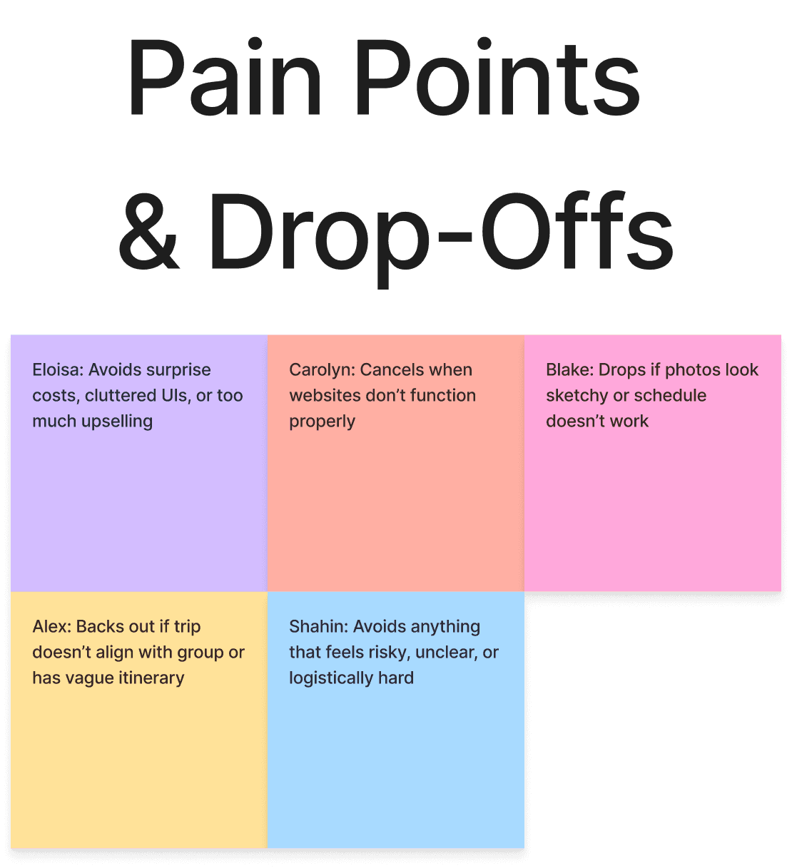
Affinity Map – Structured by Experience Flow
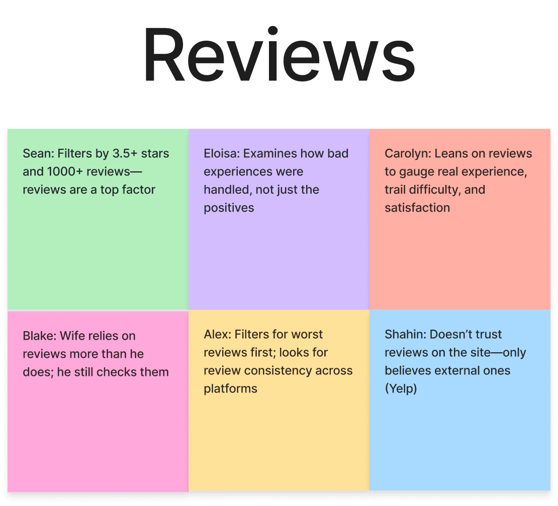
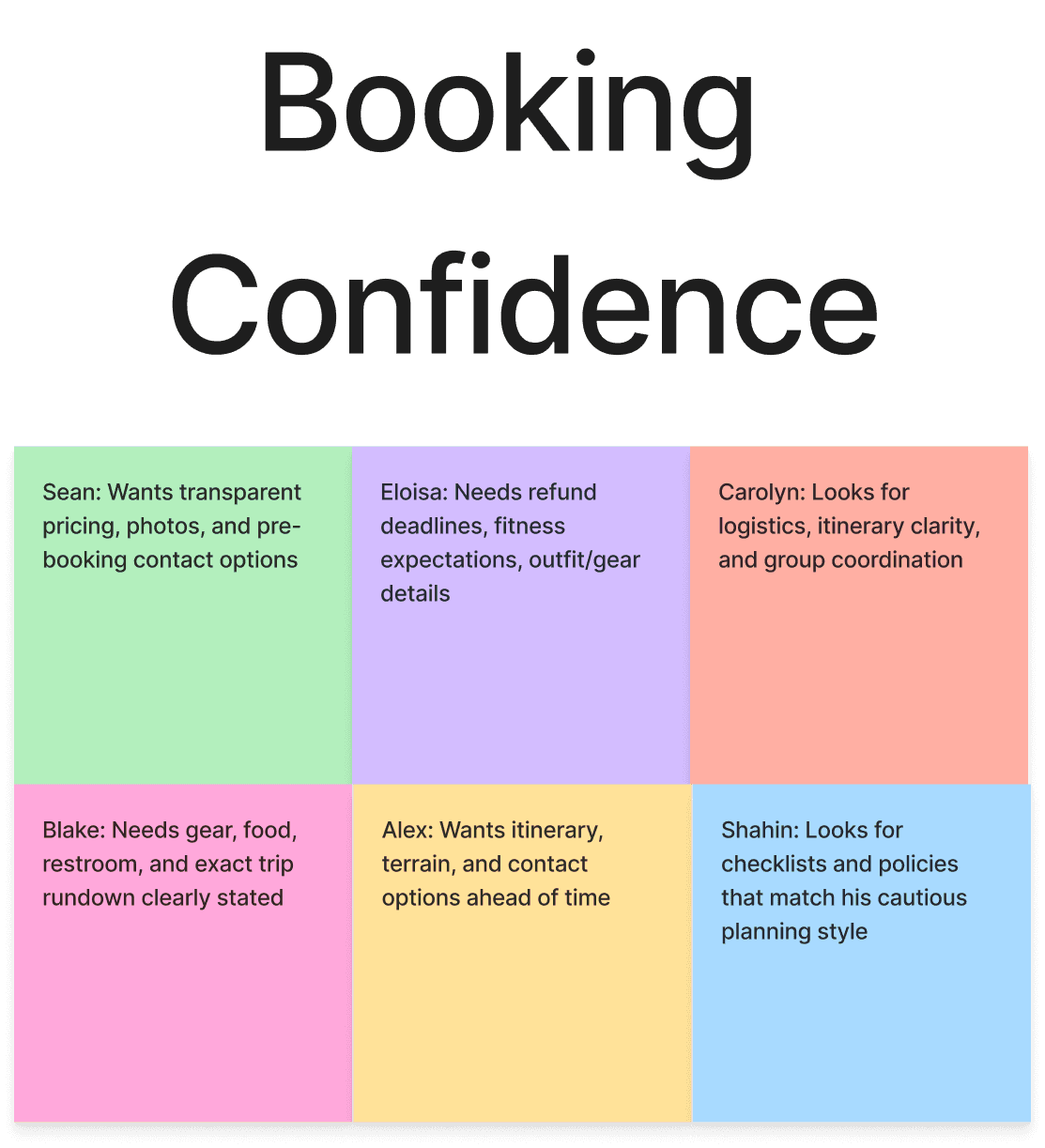
Patterns emerged around trust, pricing visibility, and clarity.
Setting the Anchors: Design Decisions
The research directly shaped my design choices. Users linked outdated visuals to safety concerns, so I created a clean, credible interface that felt both professional and adventurous.
What These Changes Achieved
Together, these design decisions turned hesitation into confidence. The interface now communicates safety and professionalism at every step, helping users feel supported from their first click to their confirmed climb.
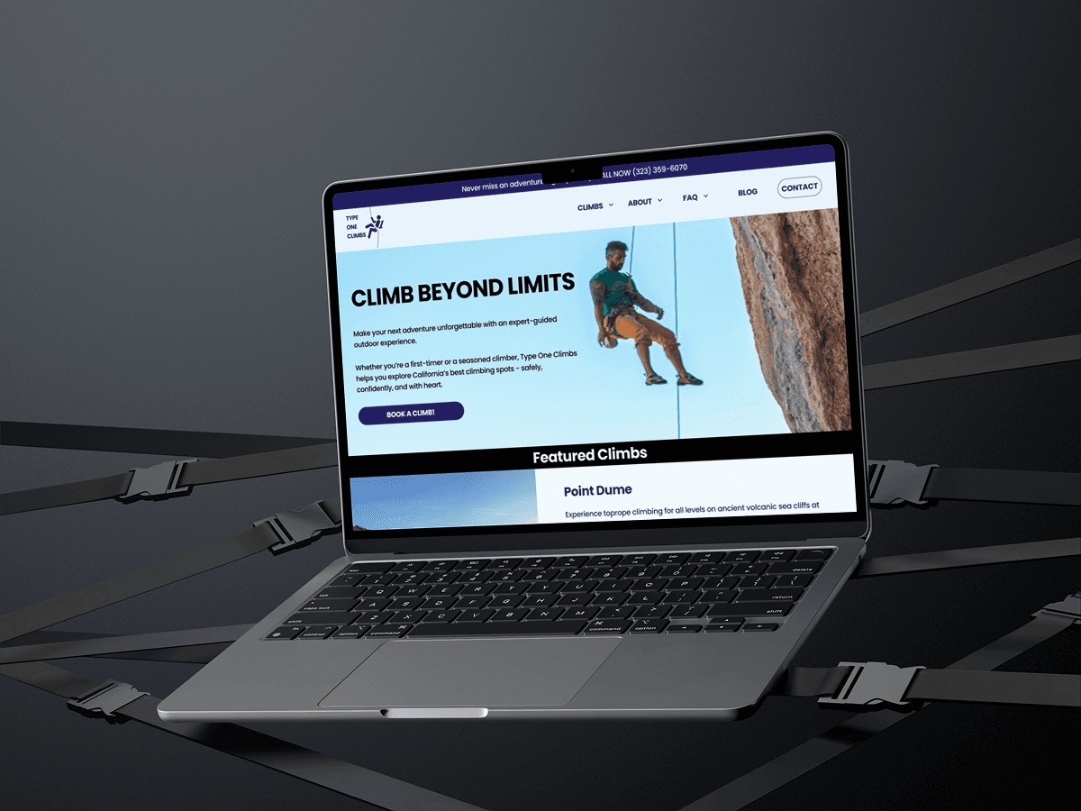
HOMEPAGE

Homepage Redesign — Building Trust Through Visual Clarity
Refreshed the layout, navigation, and calls to action to make key information like climbs, pricing, and safety details immediately accessible. High-quality imagery and a clean design system create a trustworthy, modern first impression.
ABOUT CLIMB
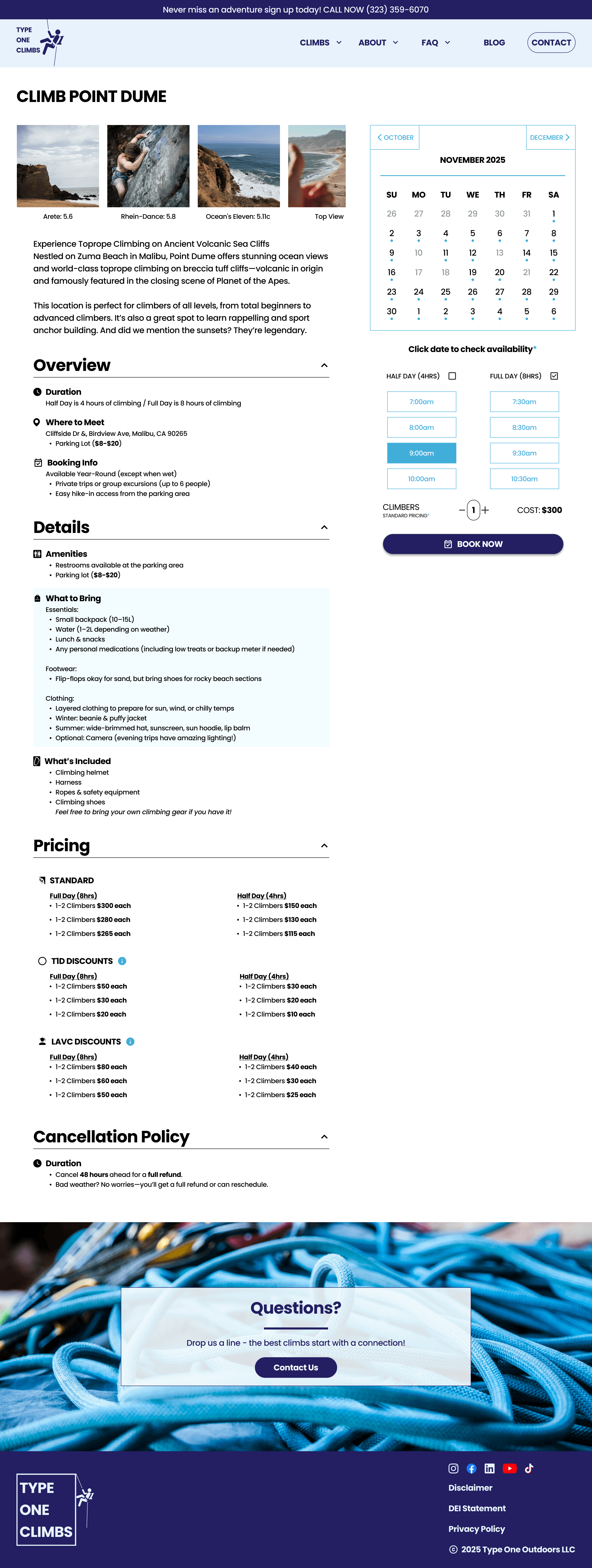
Climb Details Page — Clarity and Transparency
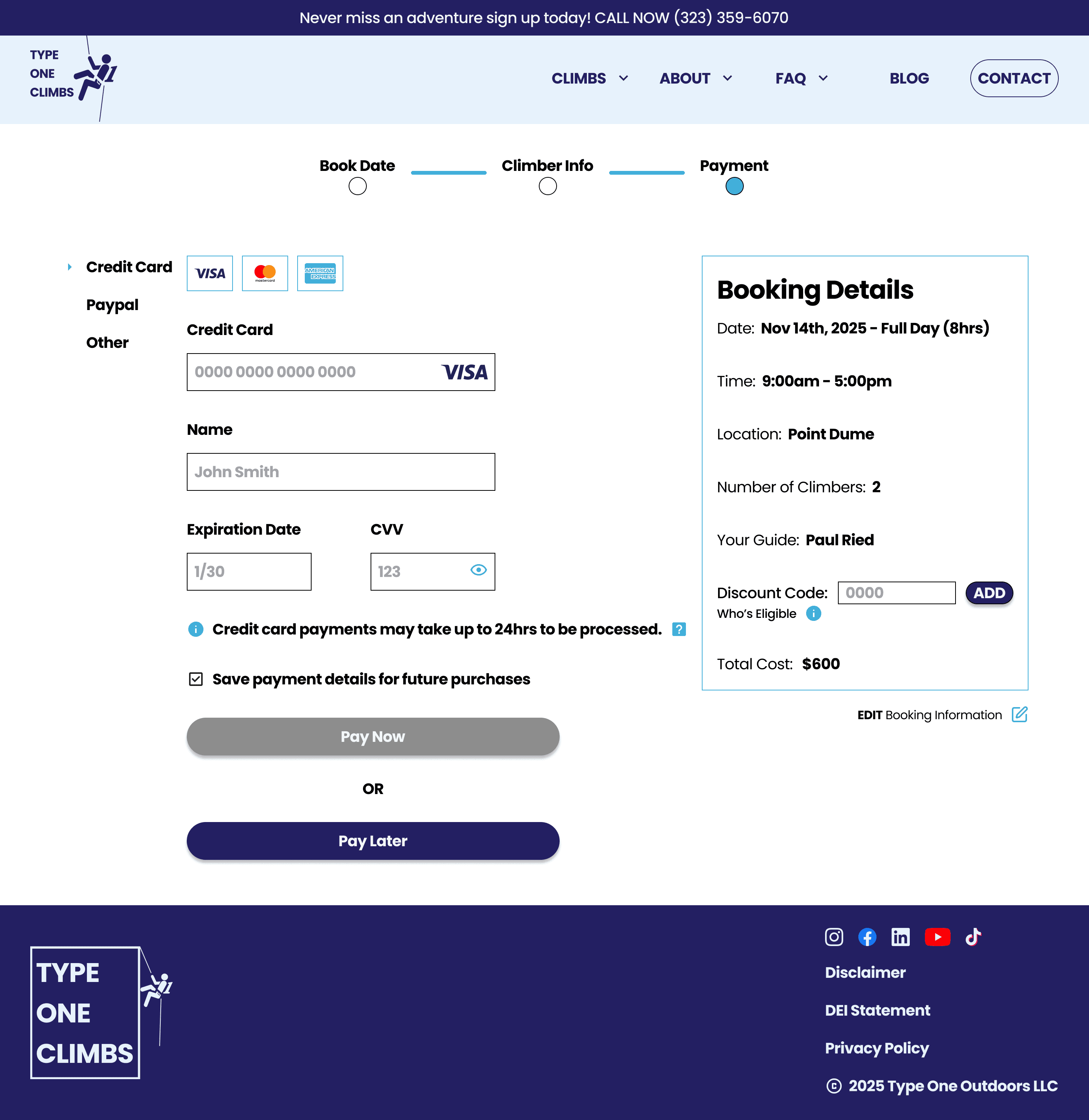
Added detailed logistics, guide info, and visible pricing upfront to reduce hesitation and help users feel confident before booking.
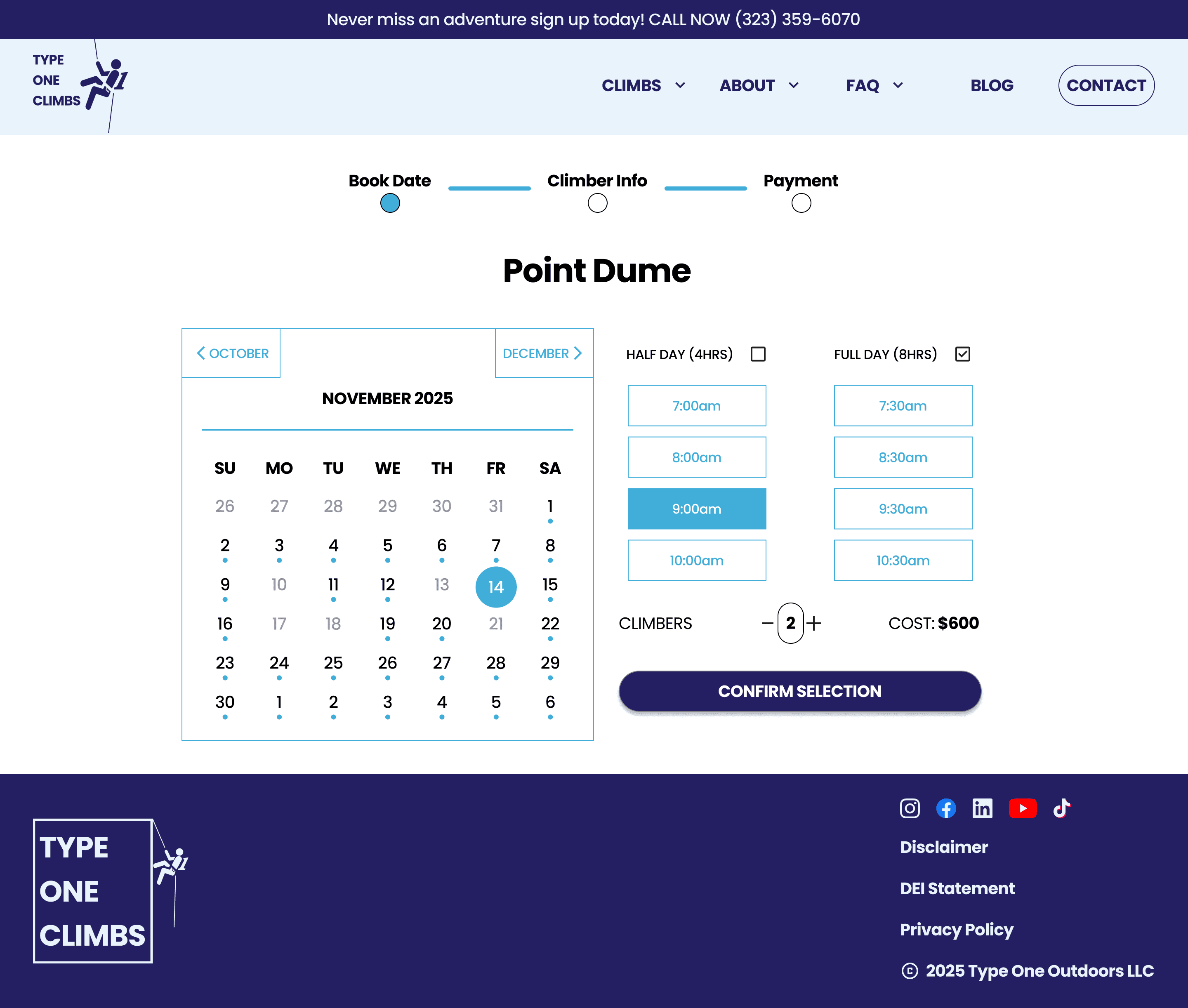
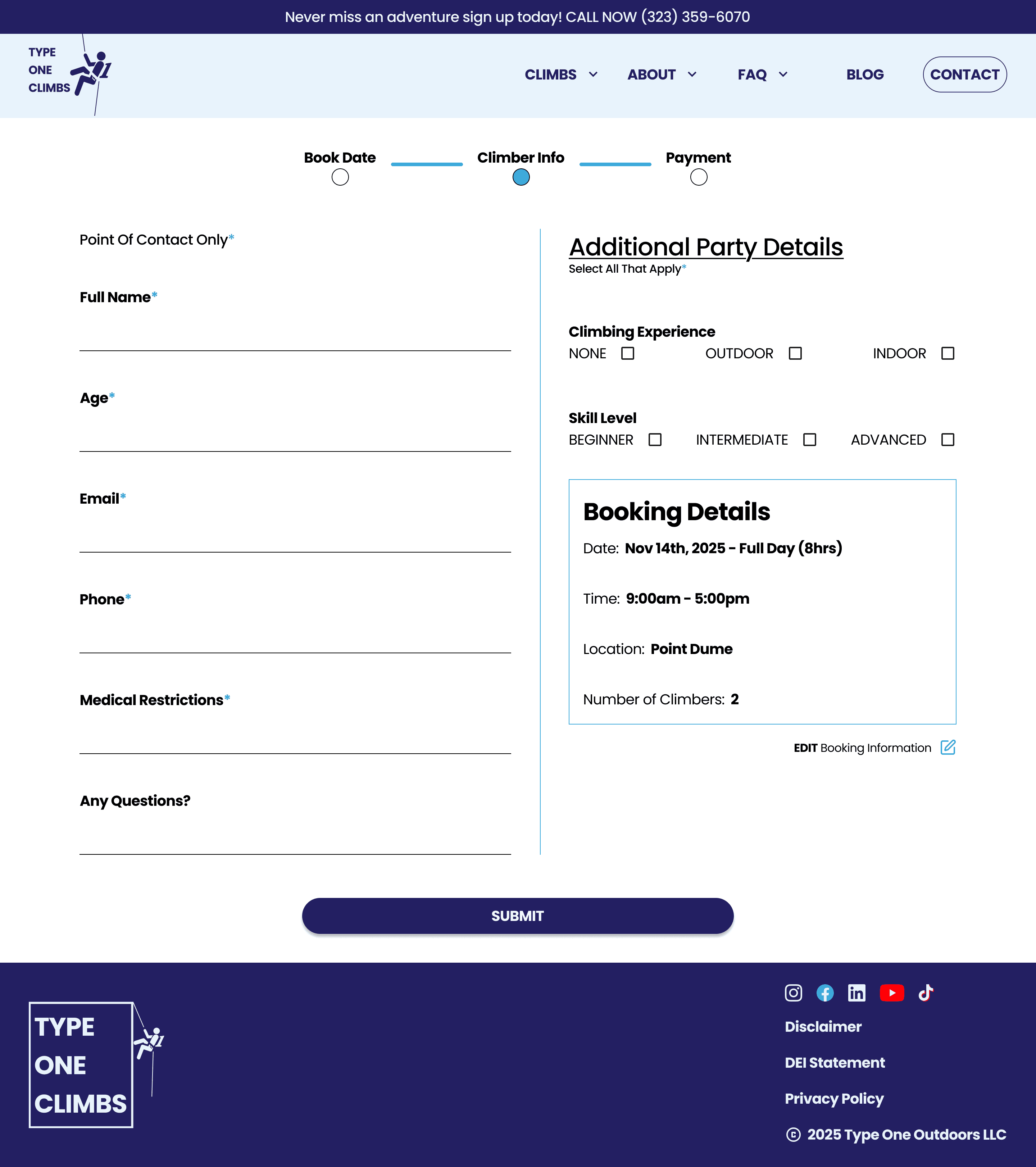
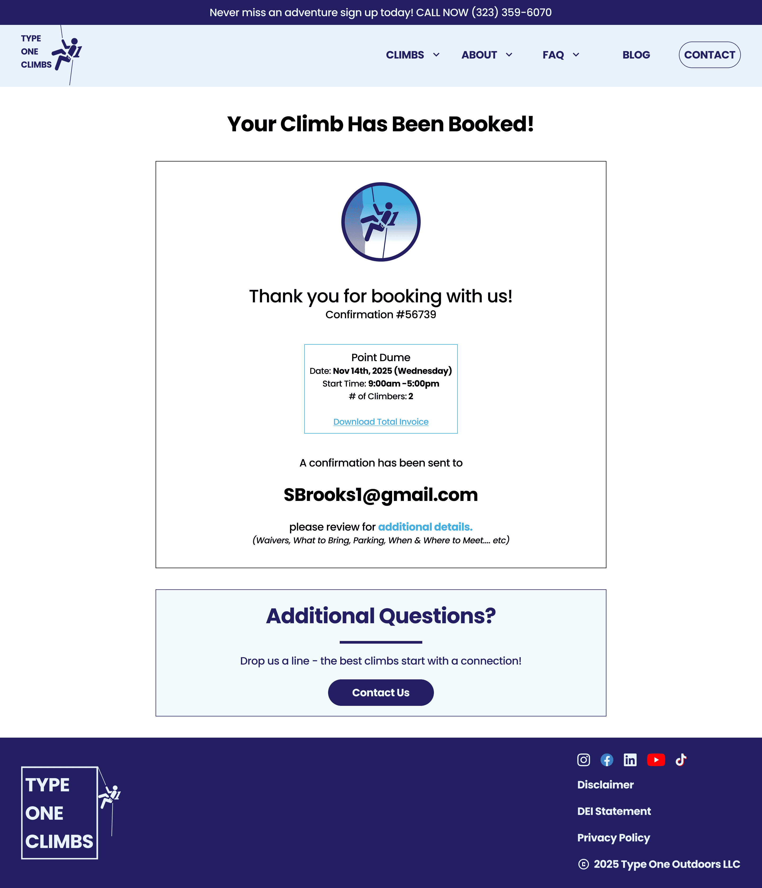
BOOKING FLOW
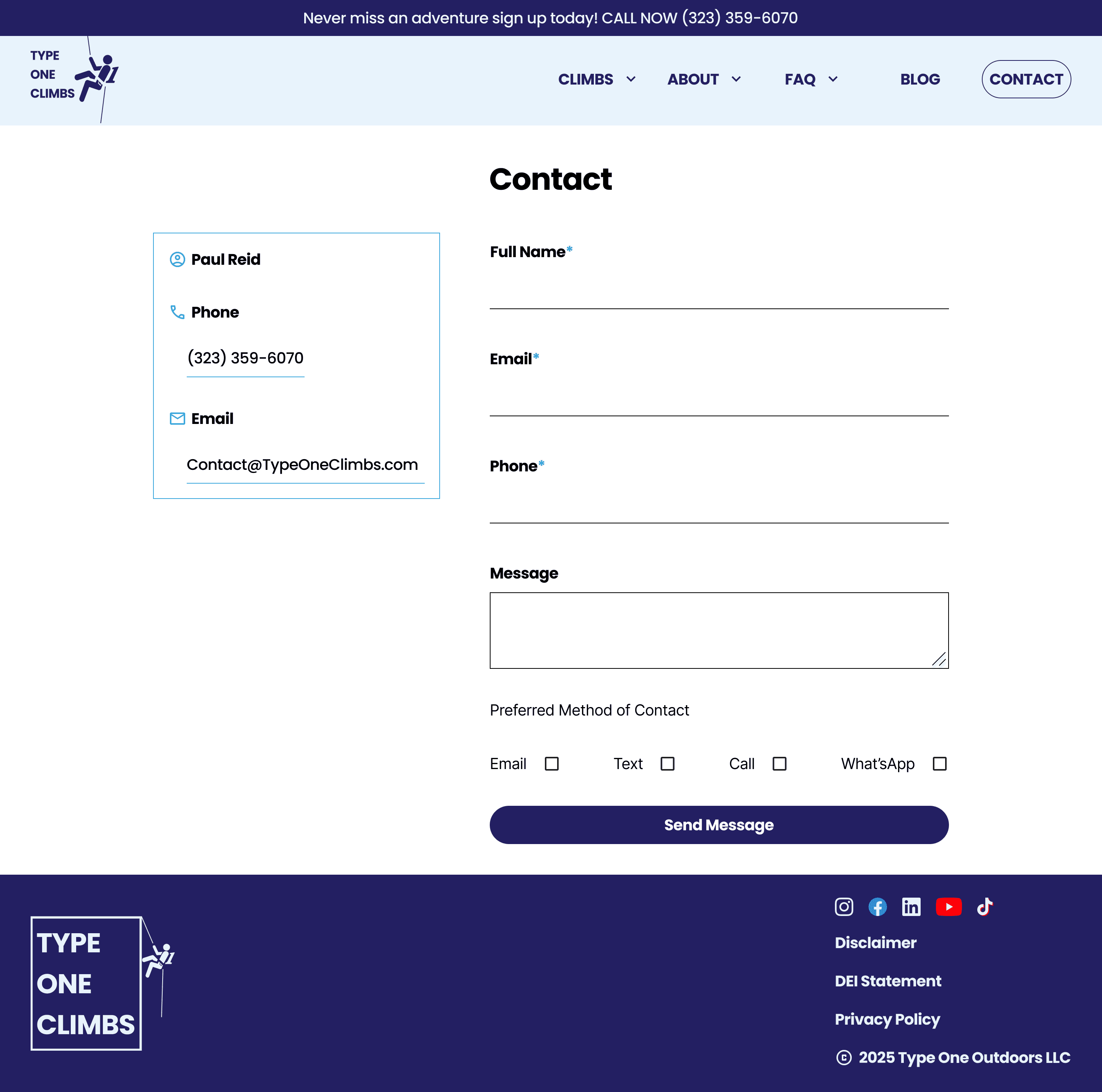
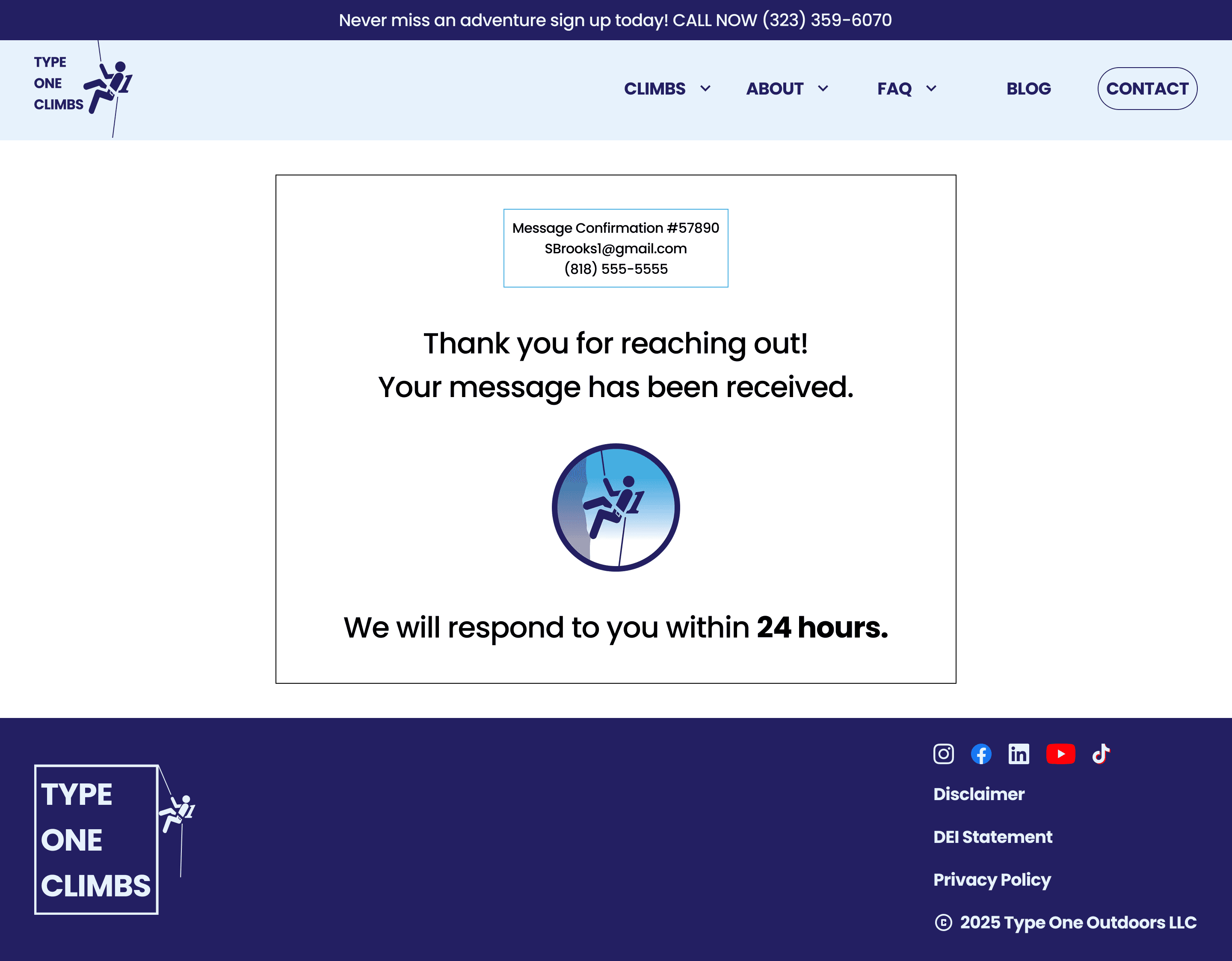
CONTACT PAGE
Reaching the Summit: Outcome
The redesign replaced uncertainty with confidence. Visitors could see reviews, certifications, and climb details upfront, while the new booking flow guided them through each step with clarity.
Users in testing described the design as clean, trustworthy, and motivating.
This project taught me that design isn’t just about usability, it’s about trust. I learned to turn emotional barriers into clear design decisions by aligning hierarchy, tone, and visuals around one goal: helping people feel safe enough to try something new.
It reminded me that trust begins long before a user clicks “Book,” and that every design detail contributes to building confidence. Getting to work on a project connected to my passion for climbing made the process especially meaningful and reminded me why I love design. If even one more person tried rock climbing because of this redesign, then it was all worth it :)
FIRST HAND RESEARCH
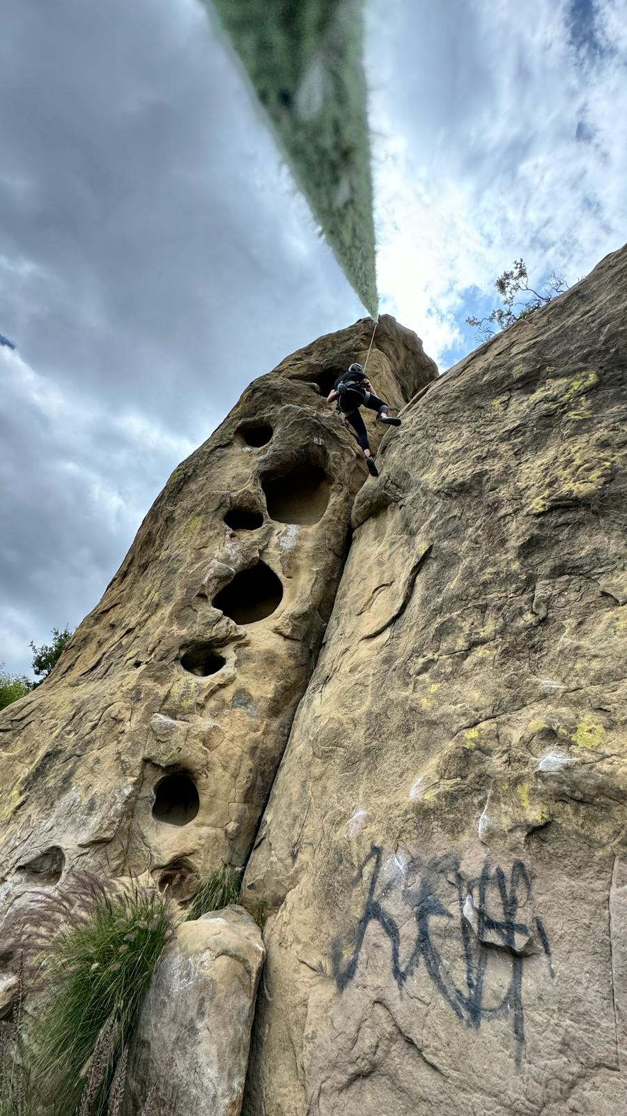
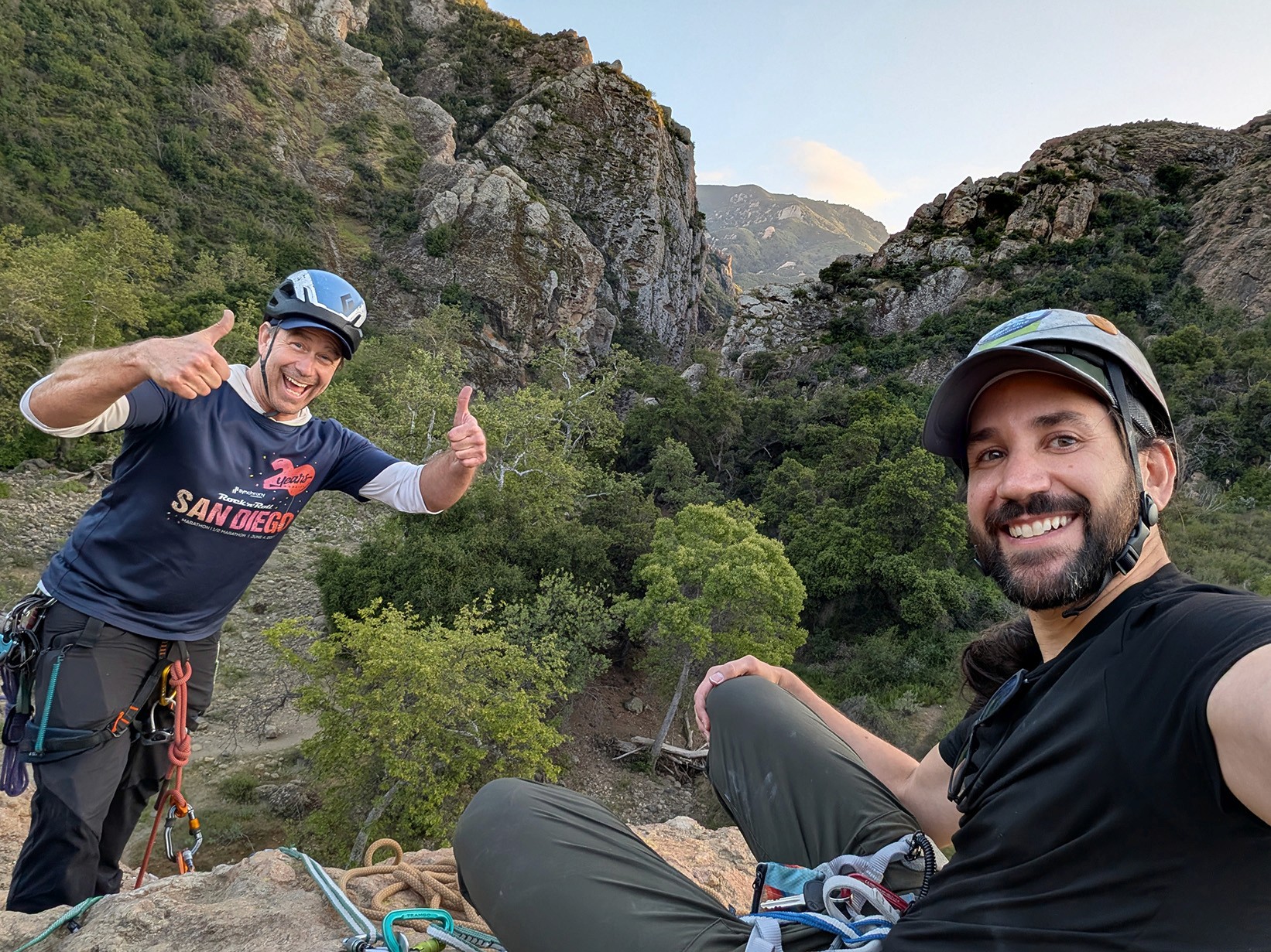
Experiencing the climbs firsthand with Paul to better understand the user journey.