

Designing for Trust, On and Off the Rock
A website redesign for a Los Angeles climbing guide that transforms outdated flows into a modern, trustworthy, and beginner-friendly booking experience.
Making It Easier for Beginners to Book Guided Climbs
Climbing is built on trust: trust in your rope, your partner, and your guide. The same principle applies when booking guided adventures online. Type One Climbs, a small guiding company in Los Angeles, had a website that felt outdated, hard to navigate, and lacking the credibility that convinces beginners to book.
In my first meeting with Paul, the founder and lead guide, he shared his vision for growing the business and his frustration that the current site was not helping new climbers take the first step. That conversation shaped my hypothesis: if the booking experience felt clear, modern, and trustworthy, more beginners would feel confident signing up for a climb.
Over the course of three months in spring 2025, I partnered with Paul to redesign the site. My goal was to create a beginner-friendly booking experience that built confidence from the first click while still capturing the adventurous spirit of climbing. This was my second capstone project at Designlab, and it was both personal and professional. Climbing is a passion of mine, and I wanted to challenge myself with a real-world project connected directly to the outdoor space I hope to work in.
Before: TOC’s Initial Homepage

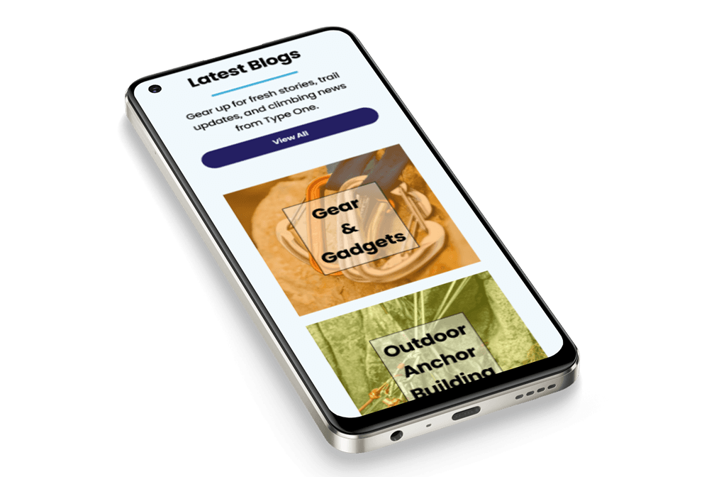
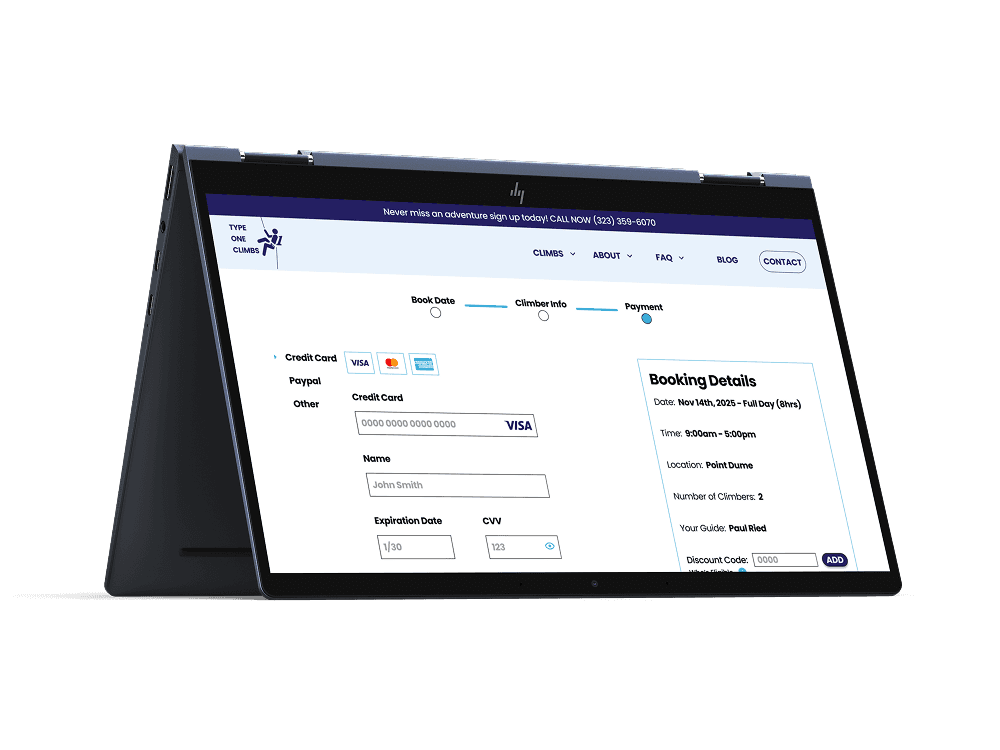
After: Redesigned Homepage

Original homepage (left) vs redesigned homepage (right) showing clearer booking flow and stronger credibility.


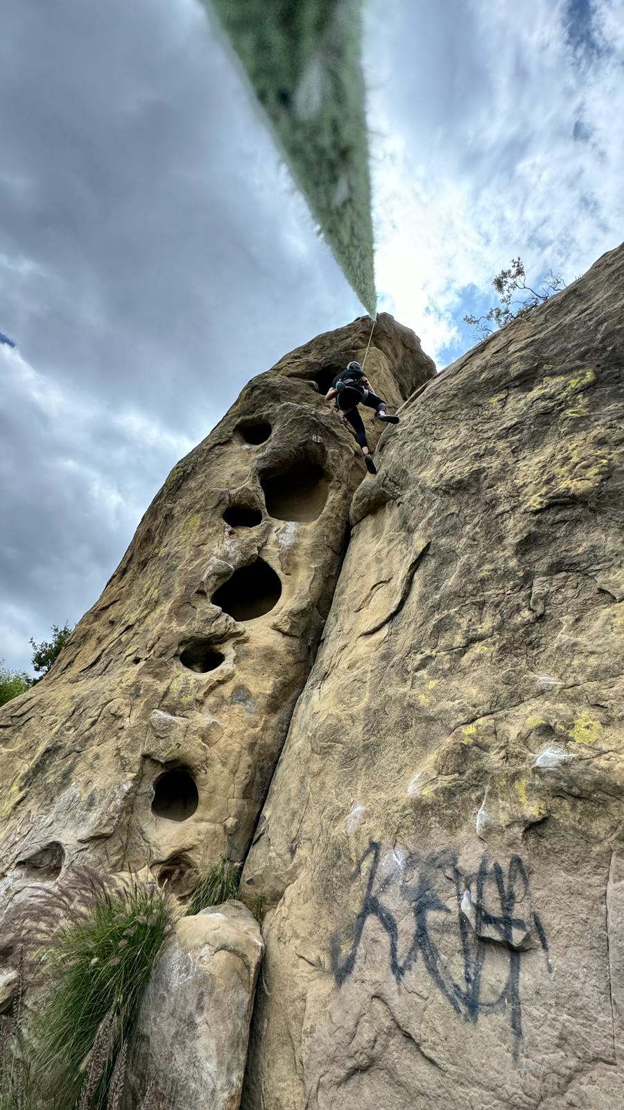
Climbing With Paul
Doing field research to get the full user experience!
What I Heard
Trust was the top barrier. Users wanted certifications, reviews, and transparent logistics before they would book.
Outdated visuals raised red flags. A site that looked unpolished was immediately seen as less safe or less professional.
Beginners needed extra support. FAQs, prep lists, and beginner-focused resources helped reduce anxiety about skills or gear.
Content needed to flow. Users wanted information presented like a story, not scattered across multiple pages.
Key Insight
Booking a guided climb is not just about logistics. It is about building credibility, reducing uncertainty, and giving beginners the support they need to take the first step.
“If I don’t see reviews or details about the guide, I’m not booking. It feels risky.”
Studying the Beta
To better understand how credibility is built in the outdoor guiding industry, I analyzed five competitor websites ranging from large organizations like Outward Bound to smaller local outfitters. I also reviewed safety standards from AMGA (American Mountain Guides Association) and PCGI (Professional Climbing Guides Institute) to see what signals users expect from professional guides.
What I Found
Trust, clarity, and credibility are the pillars of effective outdoor guiding sites.
Companies that highlighted certifications, reviews, and clear logistics inspired confidence.
Outdated design or text-heavy pages quickly raised doubts about professionalism and safety.
Few sites provided beginner-friendly resources, such as gear checklists or “what to expect” guides, leaving first-timers uncertain.
Opportunity
For Type One Climbs, the opportunity was clear: create a modern, trustworthy, and beginner-friendly website that highlights certifications, showcases guides, and provides clarity at every step of the booking flow.
I used these lessons to prioritize features like clear booking flows, visible certifications, beginner resources, and strong visuals in my redesign.


DEFINE


DESIGN


Conclusion
Lessons from the Climb
What I Learned: Trust Lives in the Details
Early on, I assumed usability would be the biggest hurdle. But research and testing revealed that the real barrier was trust. People were not just struggling with navigation, they were questioning whether they could rely on the service at all. The look and feel of the site directly shaped their sense of safety.
High-quality images gave users confidence that the gear was professional. Clear information architecture made them feel the company was organized. Even small changes in wording signaled whether they were in good hands. I saw firsthand how design decisions that might seem cosmetic can make or break someone’s willingness to book an adventure that feels risky or unfamiliar.
I also learned the importance of fidelity at the right moments. Moving into high-fidelity earlier than planned unlocked more authentic feedback, because users could react to visuals, tone, and content the way they would in real life.
Finally, I learned that scope creep is inevitable. The challenge was not avoiding it completely but managing it by keeping priorities clear so new ideas did not distract from solving the core problem.
In short, this project showed me that design is not just about aesthetics. It is about creating the sense of safety that climbing itself depends on, and balancing detail, fidelity, and scope to build that trust.


Next Steps: Continuing the Climb
This redesign was just the first pitch of a much bigger route. Looking ahead, I see opportunities to keep strengthening trust, supporting beginners, and expanding Paul’s business.
Expand reviews and testimonials to build stronger social proof
Add classes and excursions to serve returning climbers and grow community
Refine mobile booking so trips feel easy to plan on the go
The foundation is now in place, the next step is helping more people discover climbing as an adventure that’s both safe and accessible.
I’m proud of transforming an outdated site into an experience users described as clean, trustworthy, and motivating. More than proving I can guide a redesign from messy beginnings to a thoughtful solution, this project reminded me how much I love designing for the outdoors. And most of all, I hope this work brings more people to the mountain, creating future climbers ready for their first adventure.
What I’m Most Proud Of
This redesign was just the first pitch of a much bigger route. Looking ahead, I see opportunities to keep strengthening trust, supporting beginners, and expanding Paul’s business.
Expand reviews and testimonials to build stronger social proof
Add classes and excursions to serve returning climbers and grow community
Refine mobile booking so trips feel easy to plan on the go
The foundation is now in place, the next step is helping more people discover climbing as an adventure that’s both safe and accessible.
I’m proud of transforming an outdated site into an experience users described as clean, trustworthy, and motivating. More than proving I can guide a redesign from messy beginnings to a thoughtful solution, this project reminded me how much I love designing for the outdoors. And most of all, I hope this work brings more people to the mountain, creating future climbers ready for their first adventure.

Designing for trust is what turns hesitation into action.
Final Note for Employers
This project reminded me why I love design: it’s not just about making things usable, it’s about building trust so people feel ready for new experiences. If my work helps even a few more people discover climbing, then I’ve done my job.
– Max Szollosi, UX Designer & Researcher


