Exploring a dual-profile system that balances vulnerability with safety
Unlatched is a Toronto-based dating app built around honesty and emotional intelligence. I partnered with the founder to bring his dual-profile idea to life by leading the design for onboarding, the two-profile system, and the core profile-building experience. I led the research, UX, and UI design for this phase of the project. The concept is currently in development and moving toward launch.
The Challenge
Why this problem mattered and what made it complex.
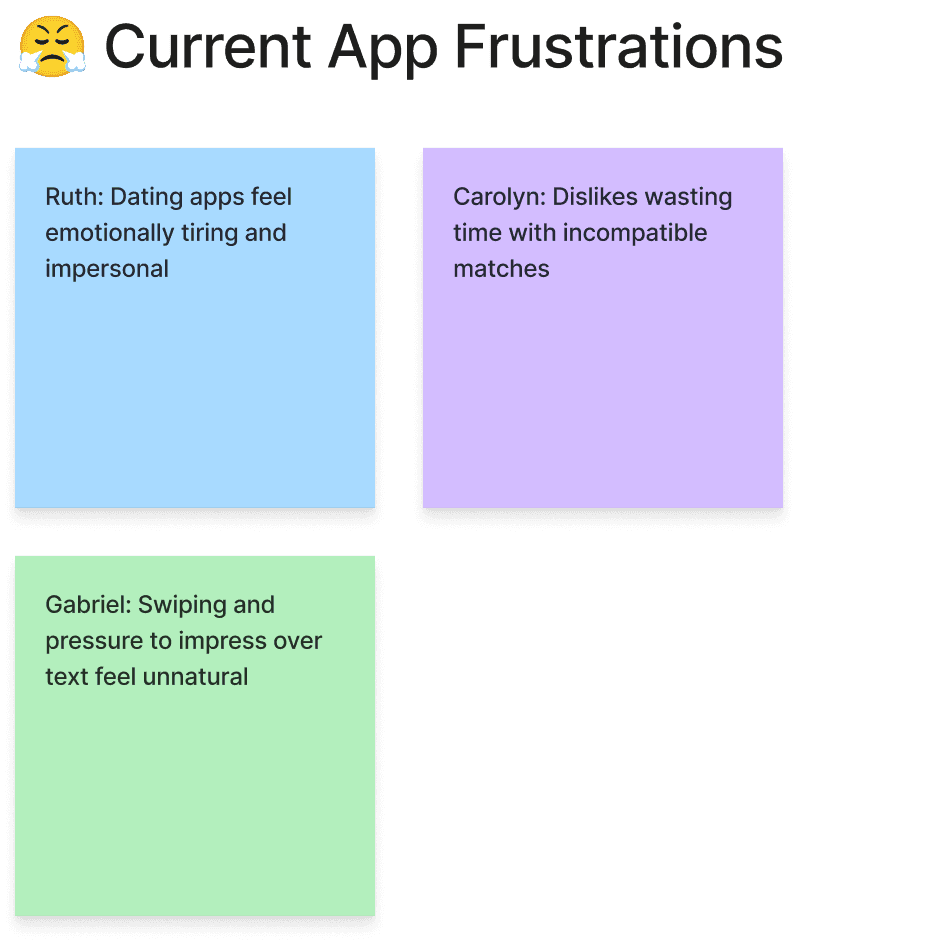
Most dating apps make people perform. Profiles feel curated, shallow, and repetitive. Unlatched wanted people to build two profiles, one polished and one unfiltered, but most users already struggle to complete a single profile. The challenge was making the flow simple, guided, and emotionally safe so users would not feel overwhelmed. Emotional honesty supported this challenge, because people only share their real personality when the experience feels low pressure and in their control.
Research Highlights
What I learned from interviews, testing, and early concept work.
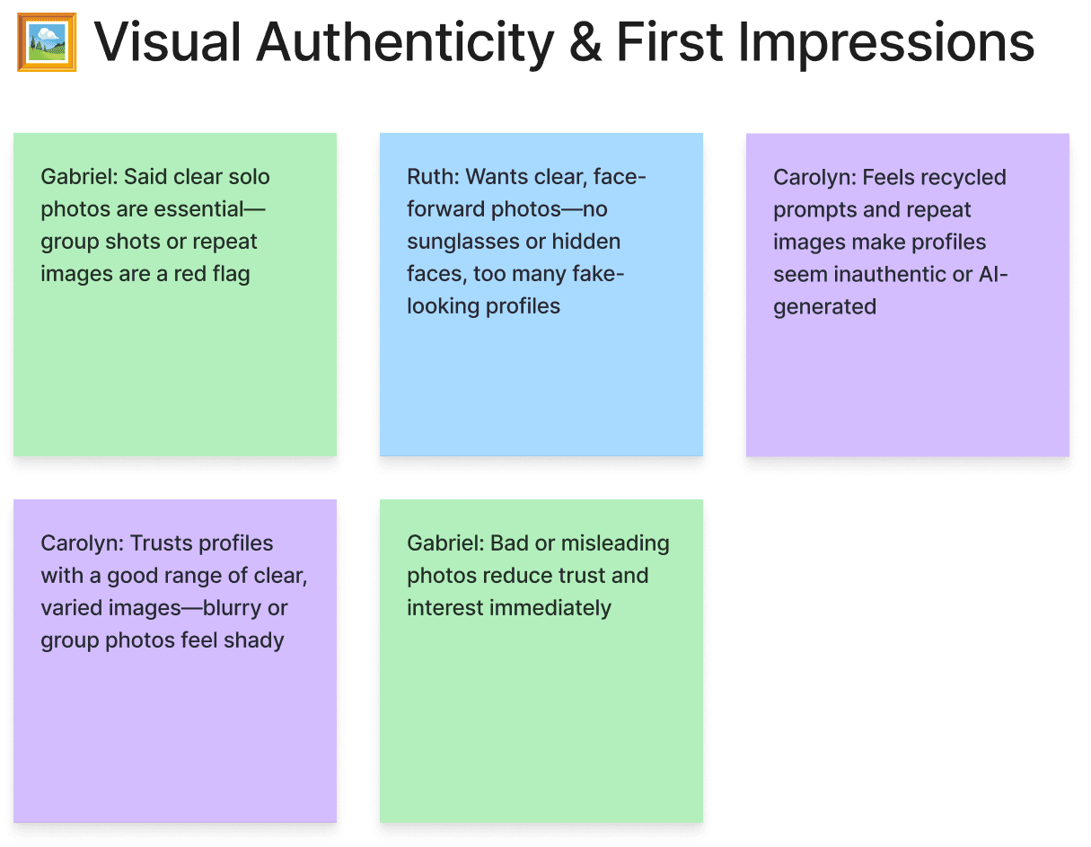
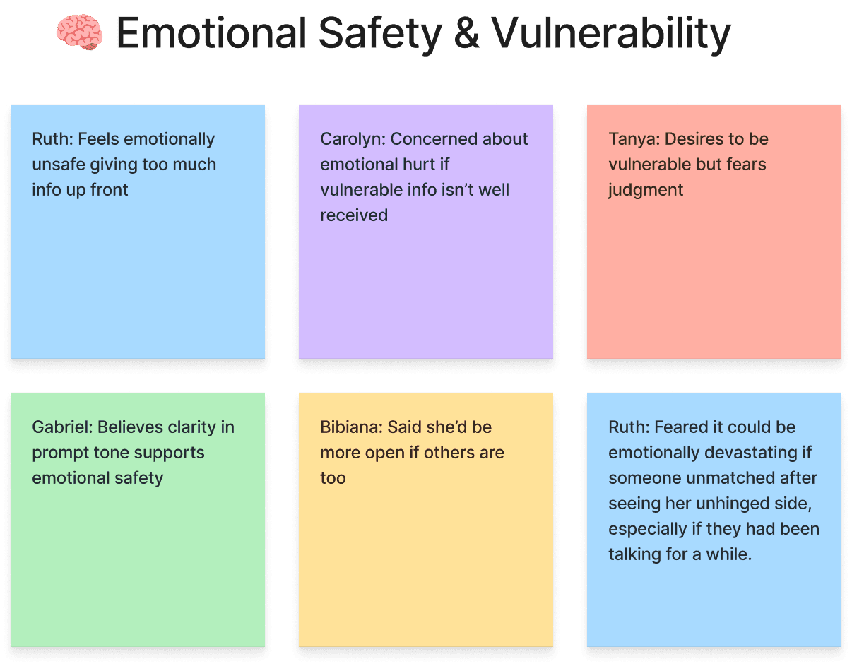
My research goal was to understand how comfortable people feel being vulnerable online and what helps or blocks them from completing profiles.
• People want to be authentic, but only when it feels safe and low pressure.
• Profiles blend together, so users want more depth and personality.
• Fun, emotionally aware prompts worked well, although bolder ones split testers.
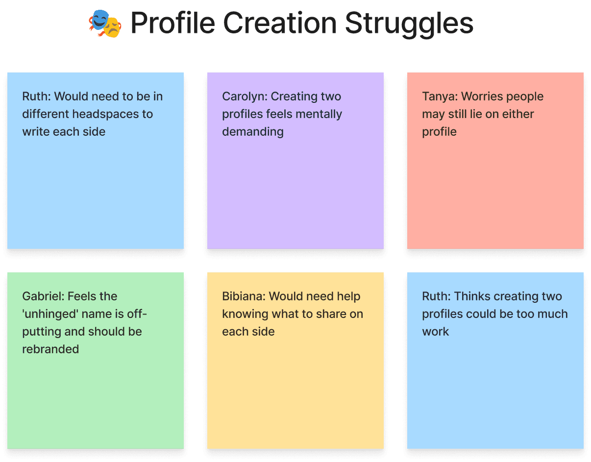
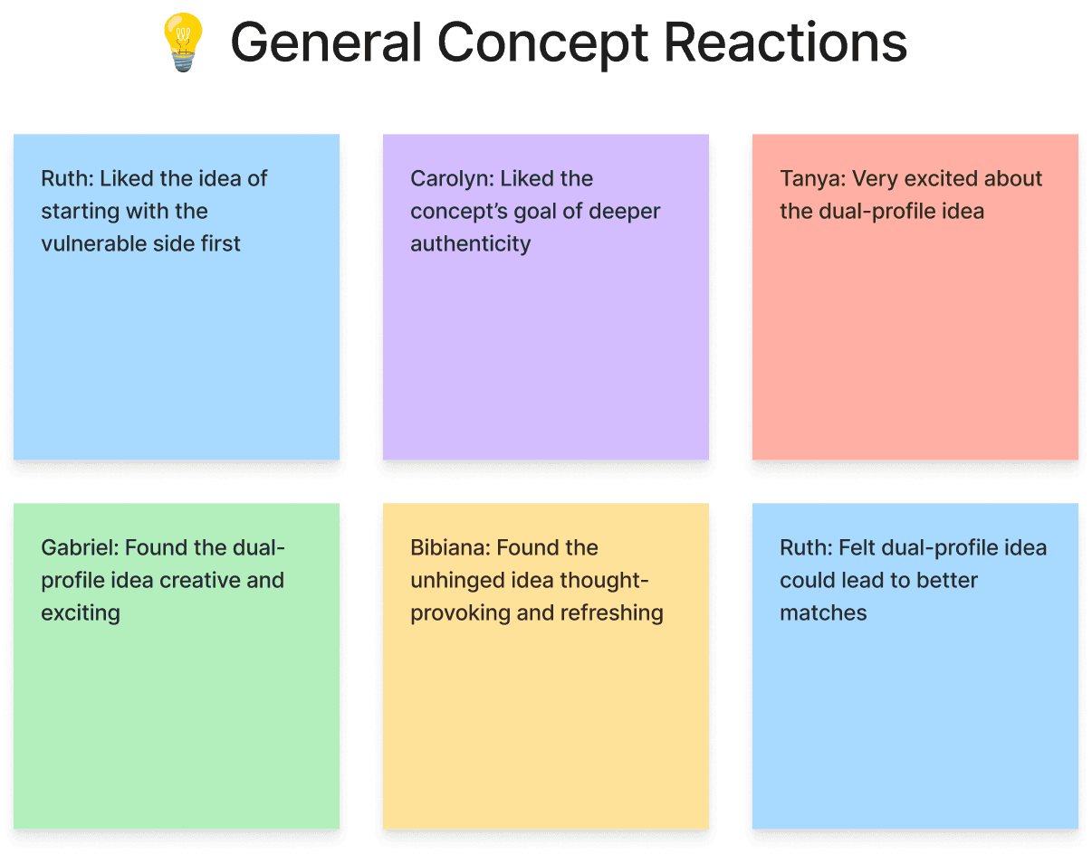
• The dual-profile idea was easy for people to understand, but the flow still felt long in practice.
• Some people loved the unfiltered side, others avoided it completely, so flexibility mattered.
These insights guided a persona focused on comfort, clarity, and emotional expression. Fun prompts also lowered pressure and helped make the two-profile flow feel more approachable.
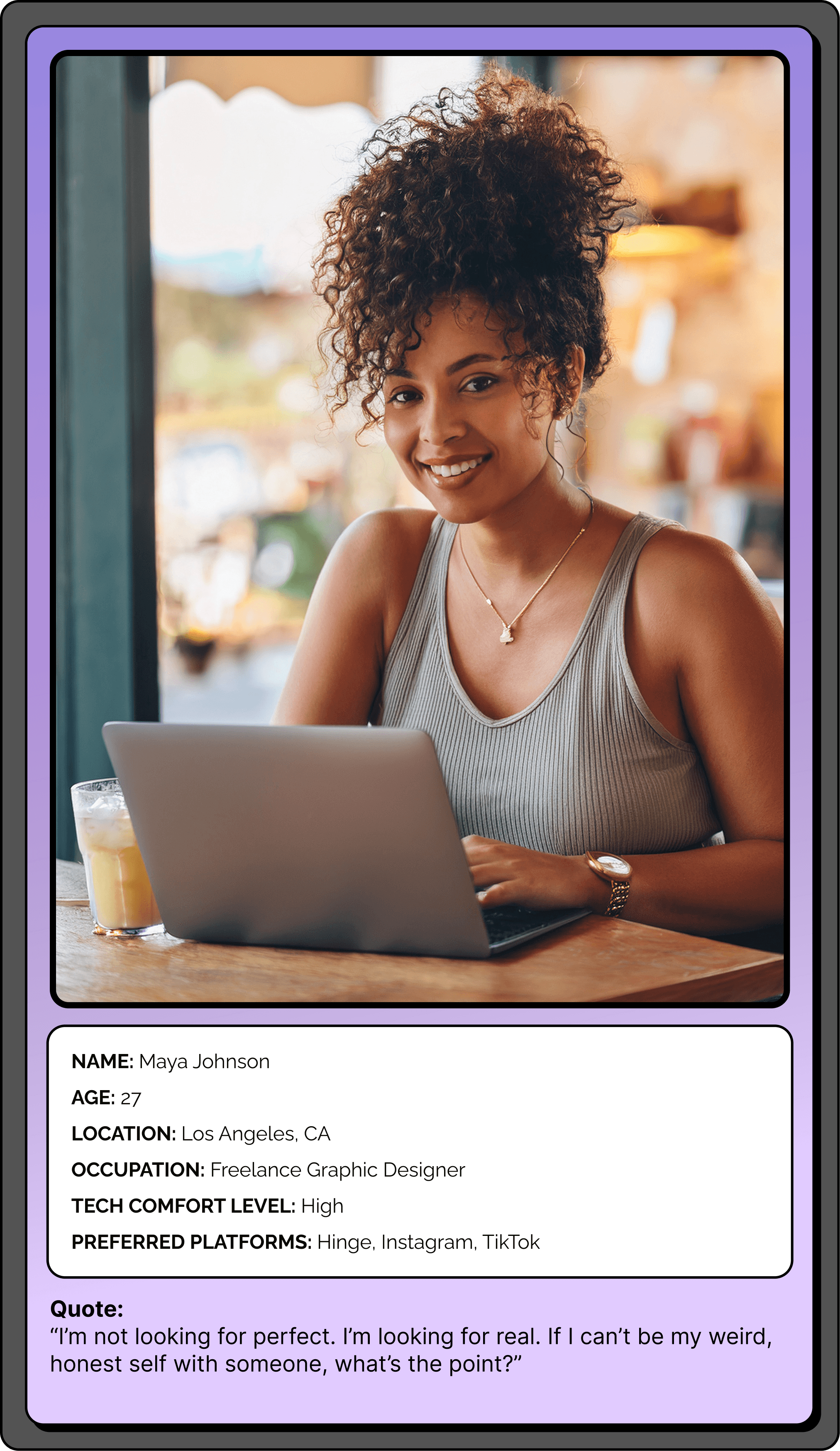
"I like the idea of being real, but not if it feels forced."
- Ruth
Key Insights That Shaped the Design
What I took from research and how it informed the solution.
• Users share more when they feel in control.
• Emotional intelligence works best when it feels playful, not heavy.
• Two profiles require simple pacing and clear transitions.
• Prompts should never push people into vulnerability.
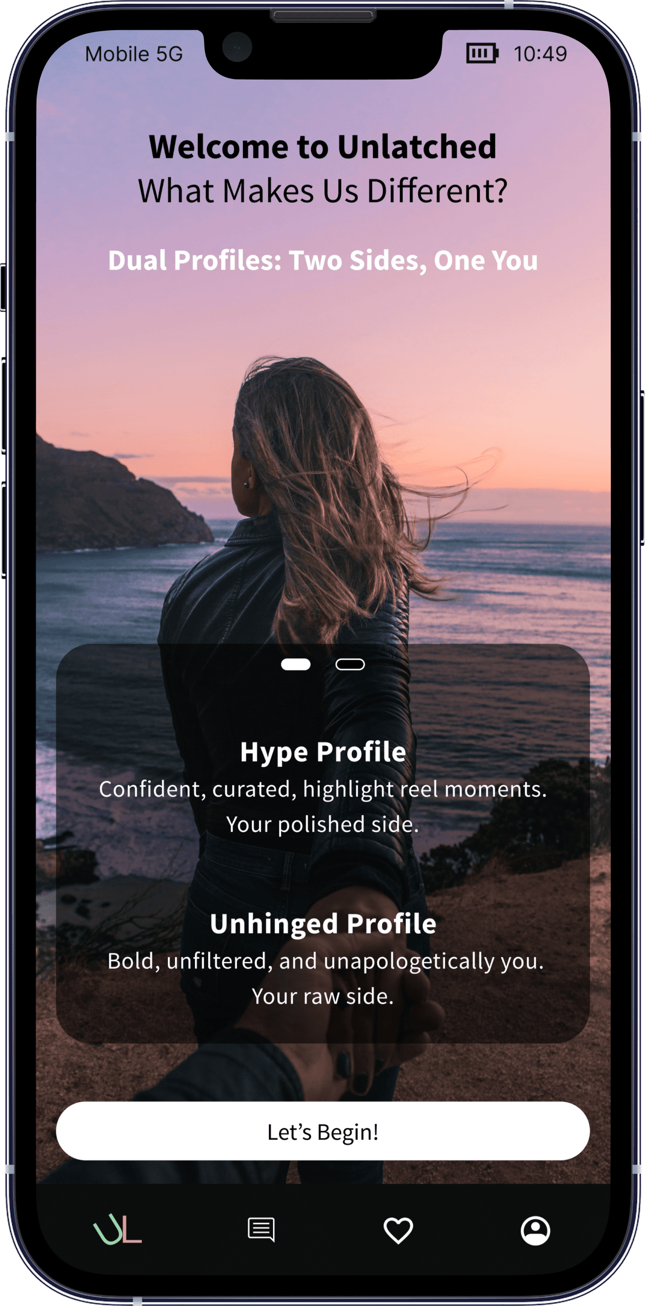
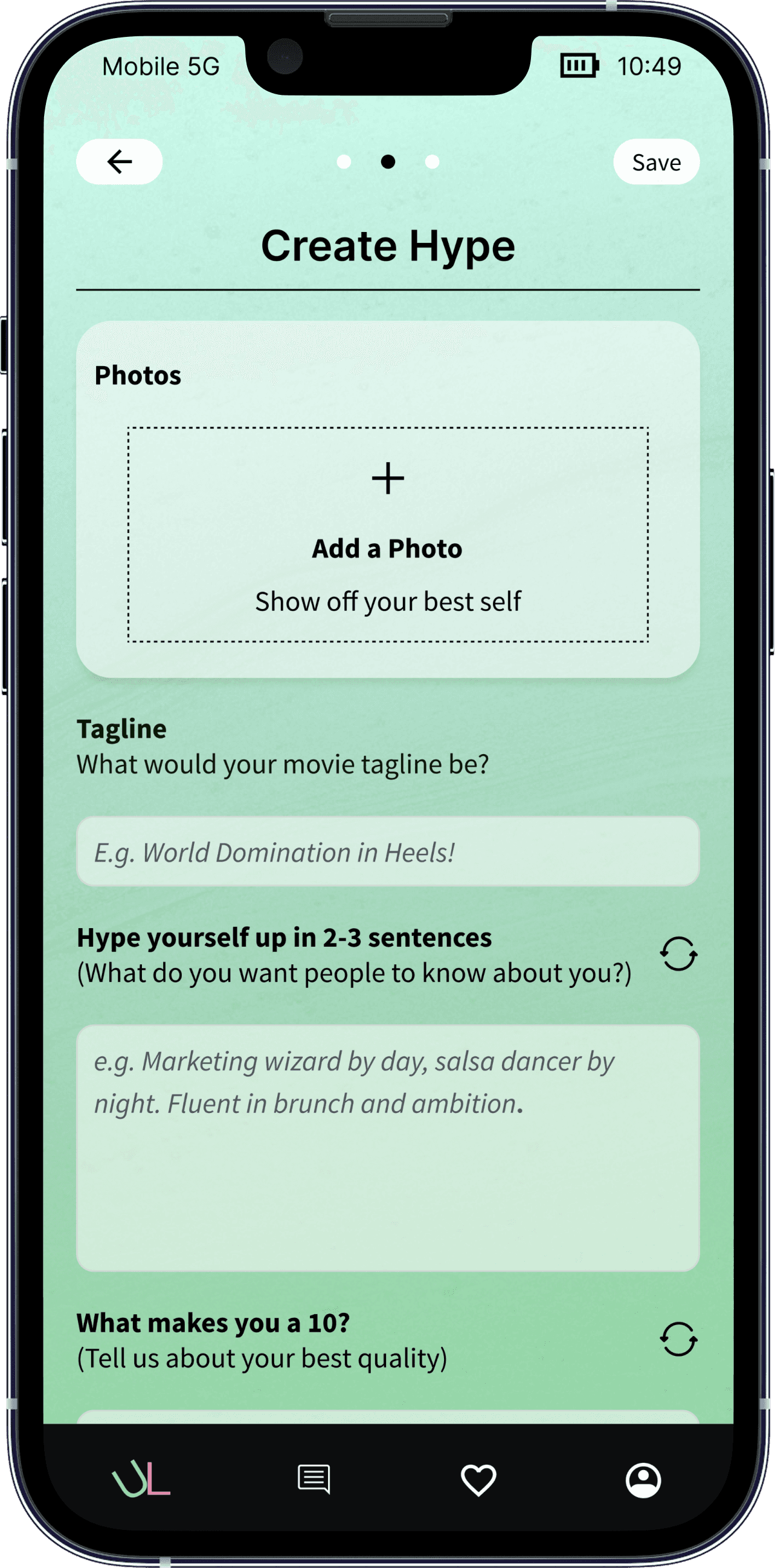
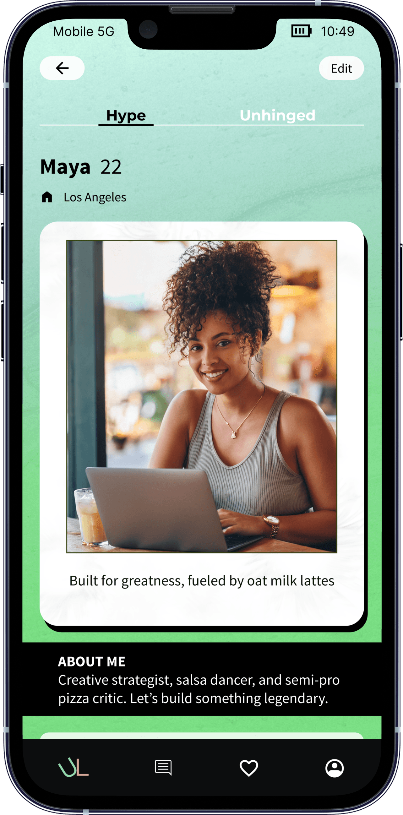
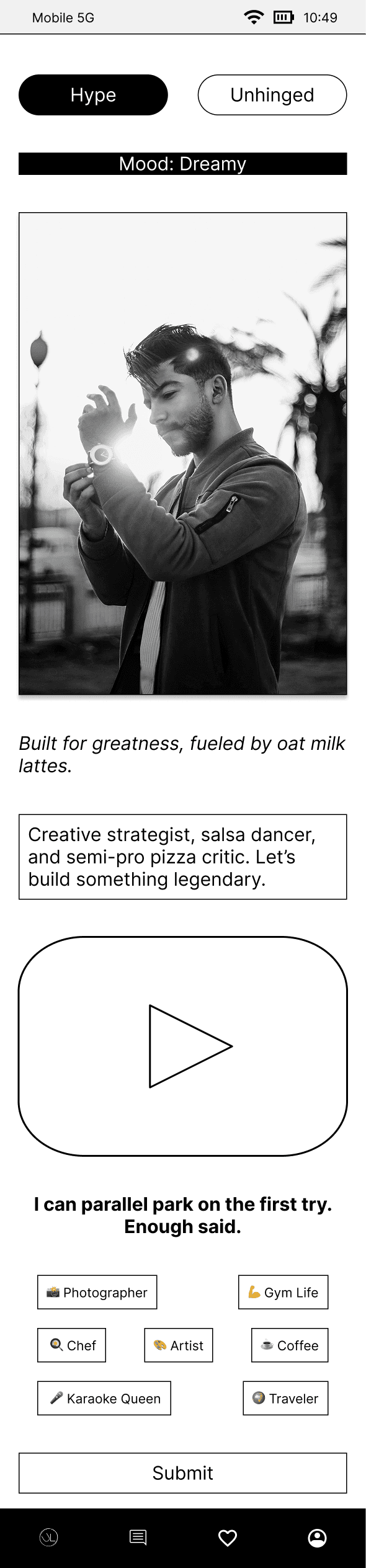
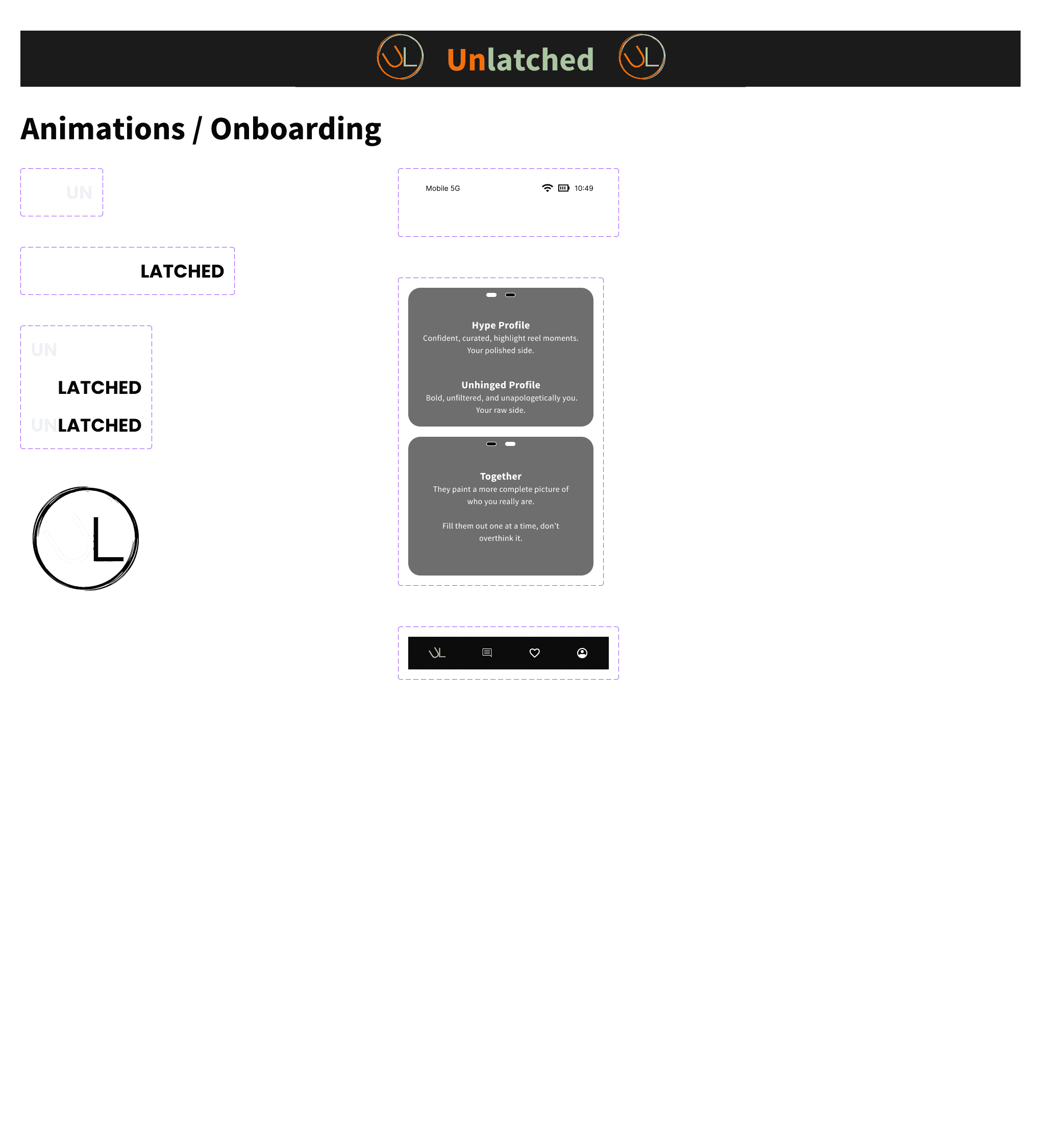
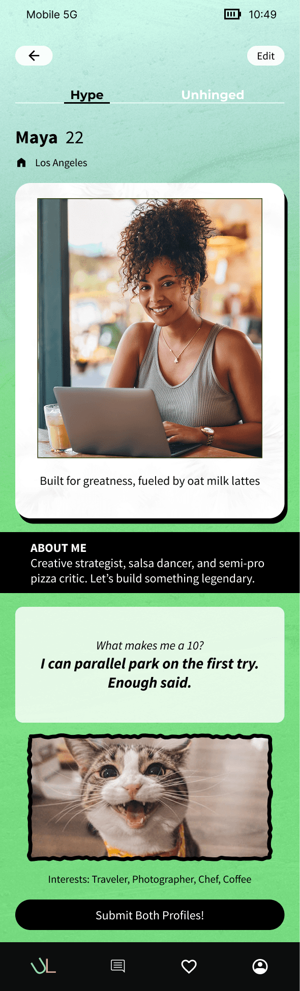
✨ HYPE PROFILE ✨
Polished
Curated Photo
Light Prompts
Safe + Controlled
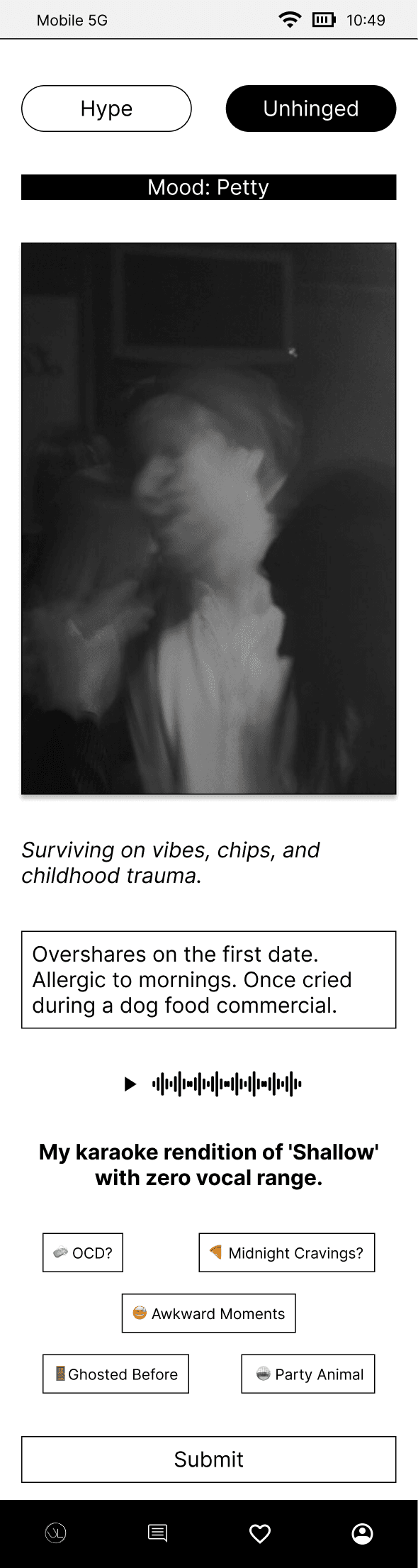
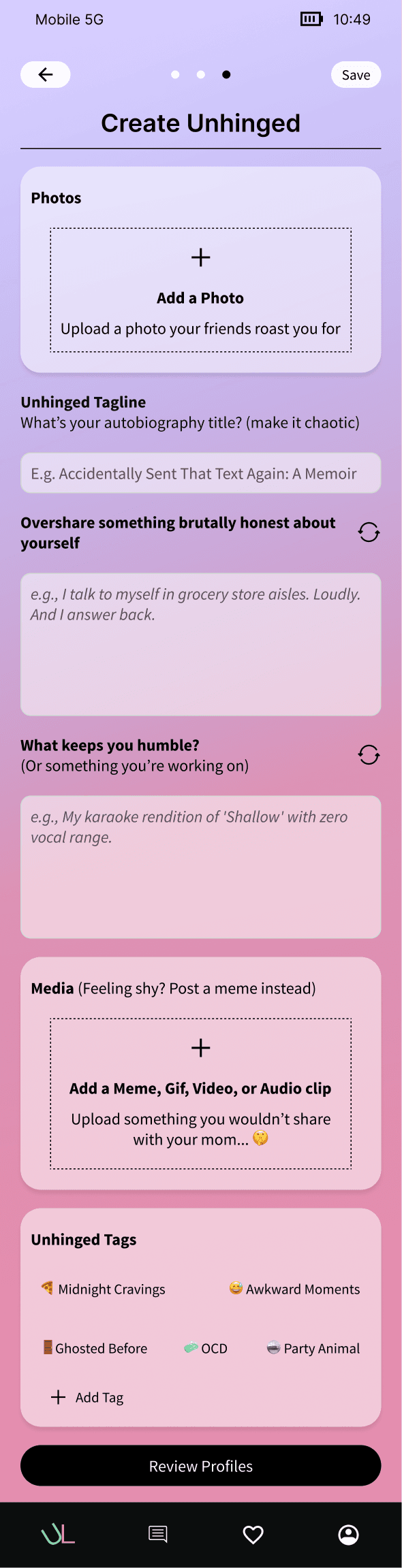
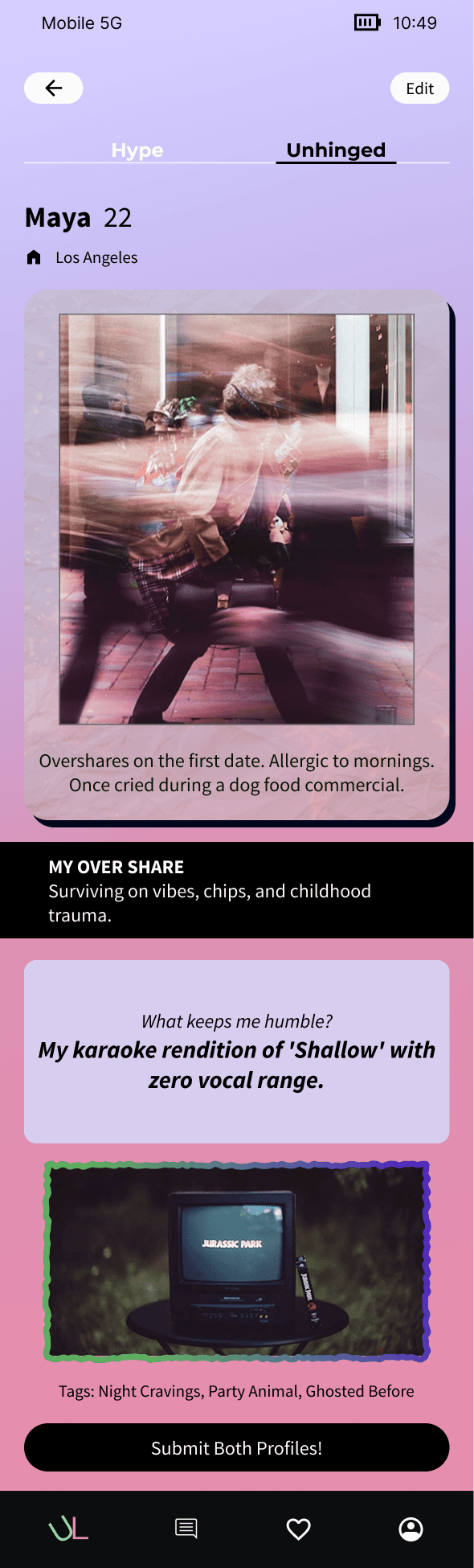
🔥 UNHINGED PROFILE 🔥
Unfiltered
Fun photo or meme
Bolder Prompts
Expressive + Real
What I Built
How I designed a guided onboarding flow focused on emotional safety.
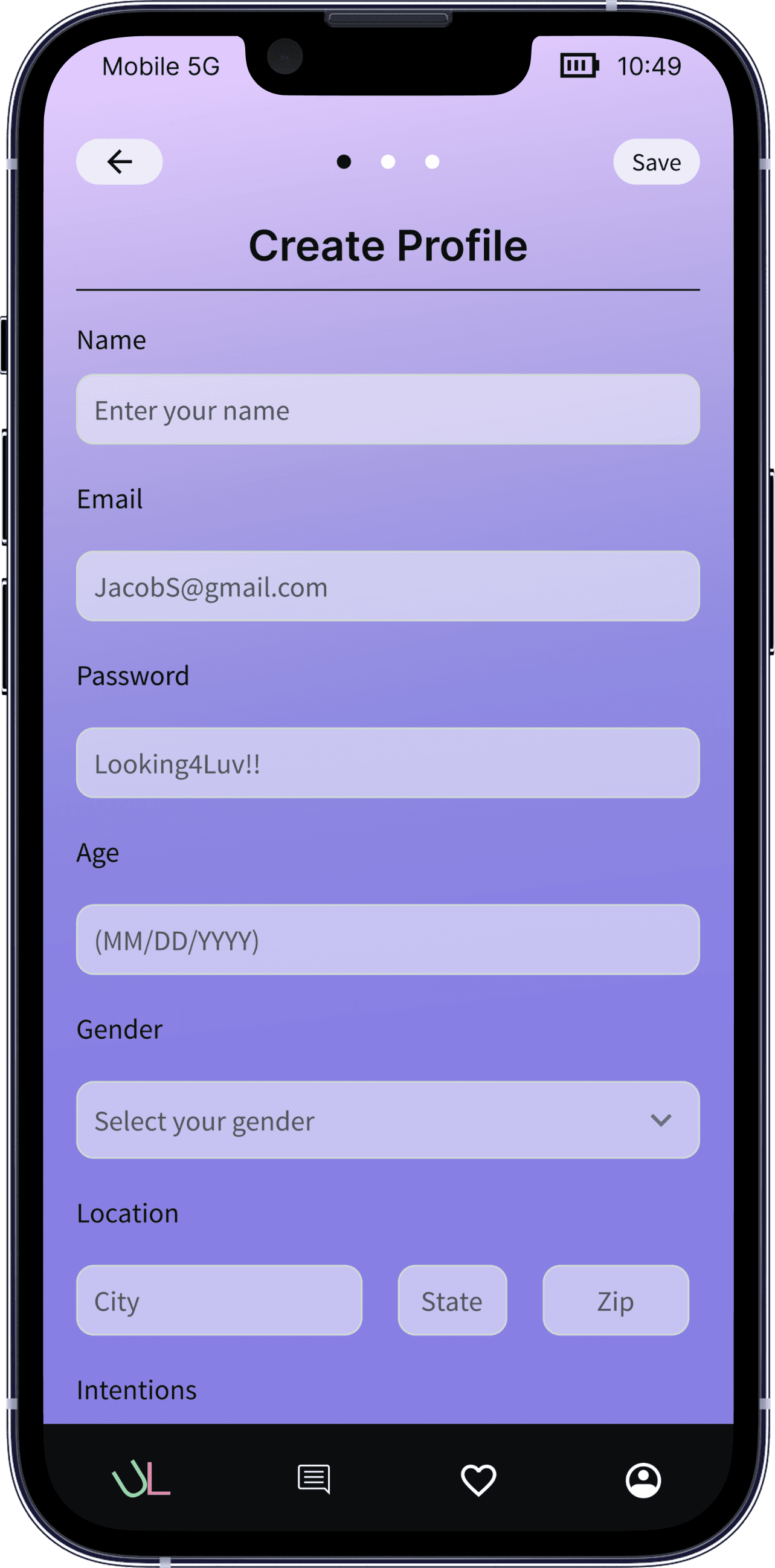
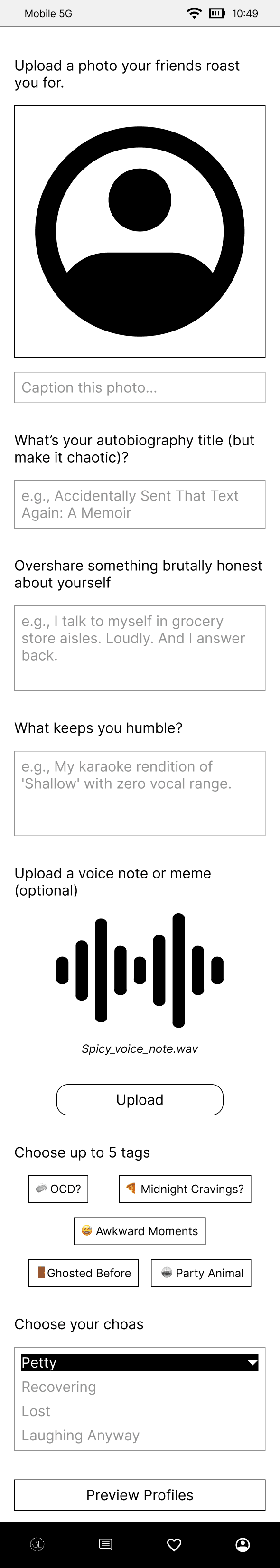
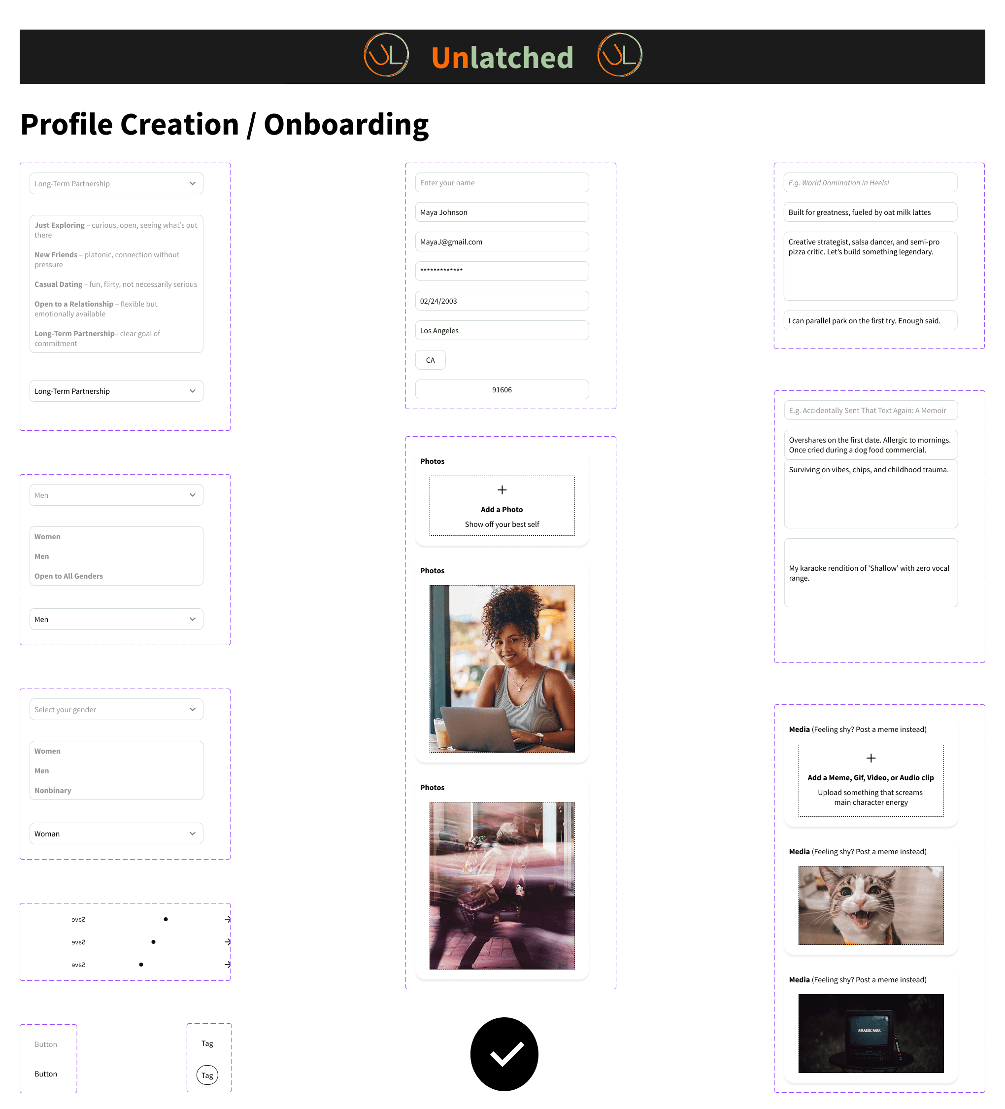
I created a two-path onboarding system built around fun, clarity, and user control. Each profile included:
• One photo
• Fun personality prompts with a question-swap option
• A media moment (video, audio, or meme)
• Interest tags and a mood picker
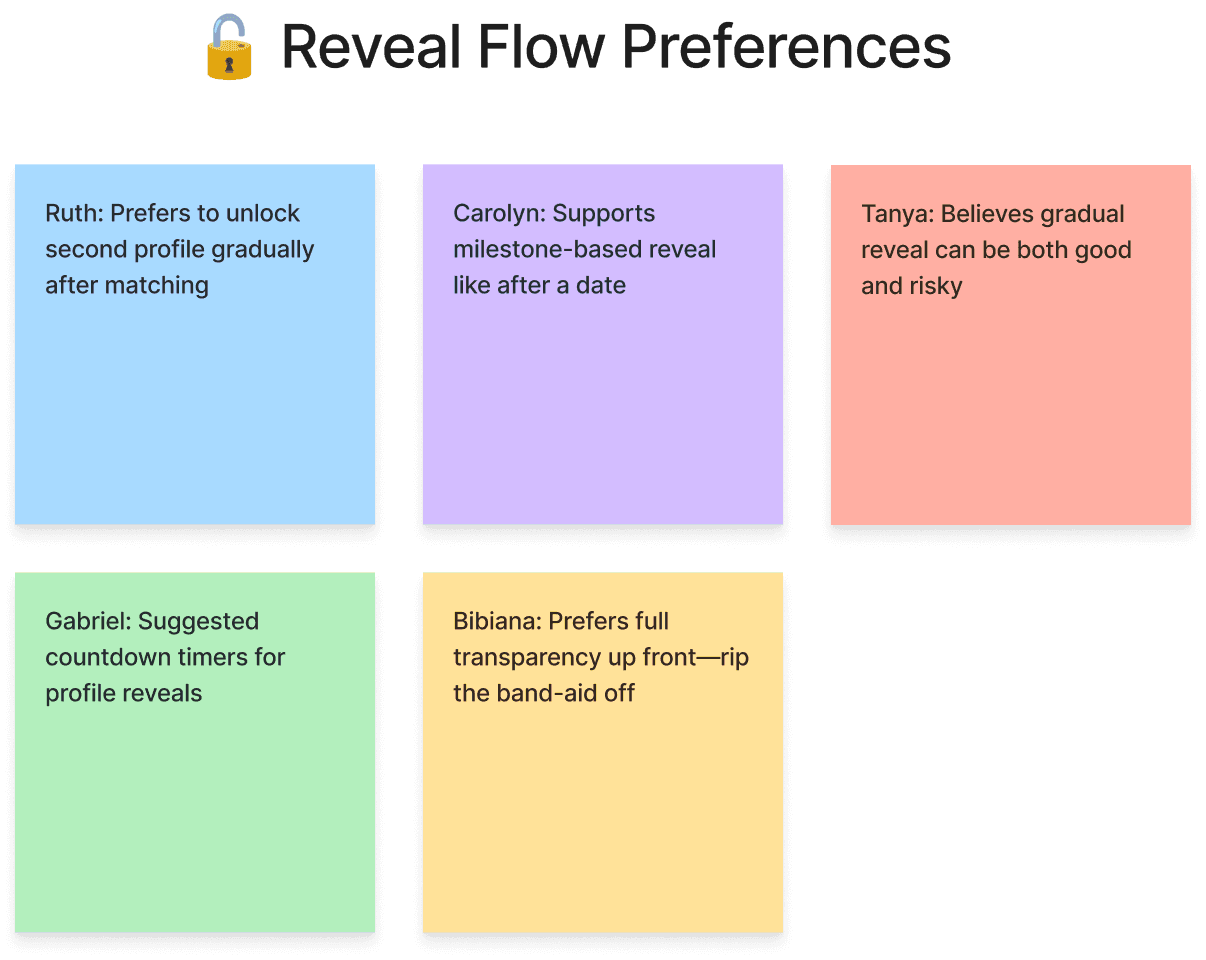
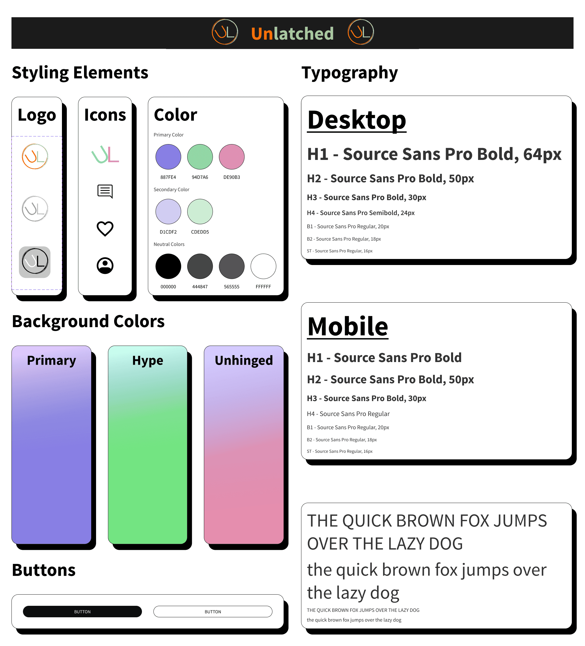
Low-fi sketches helped test pacing. Mid-fi screens validated clarity and tone. The high-fi version added stronger profile contrast, clearer transitions, softer microcopy, and a final pop-up reminding users to review both sides before publishing.
Impact
What changed and how people responded.
Testing showed the updated flow was lighter and more expressive.
People said the experience felt more personality driven than a typical swipe app.
Most said they would now complete both profiles because the flow was fun, flexible, and less overwhelming.
The founder said the experience finally matched the original idea and lifted the playful spirit of the brand.


Next Steps
Where the product could go if expanded.
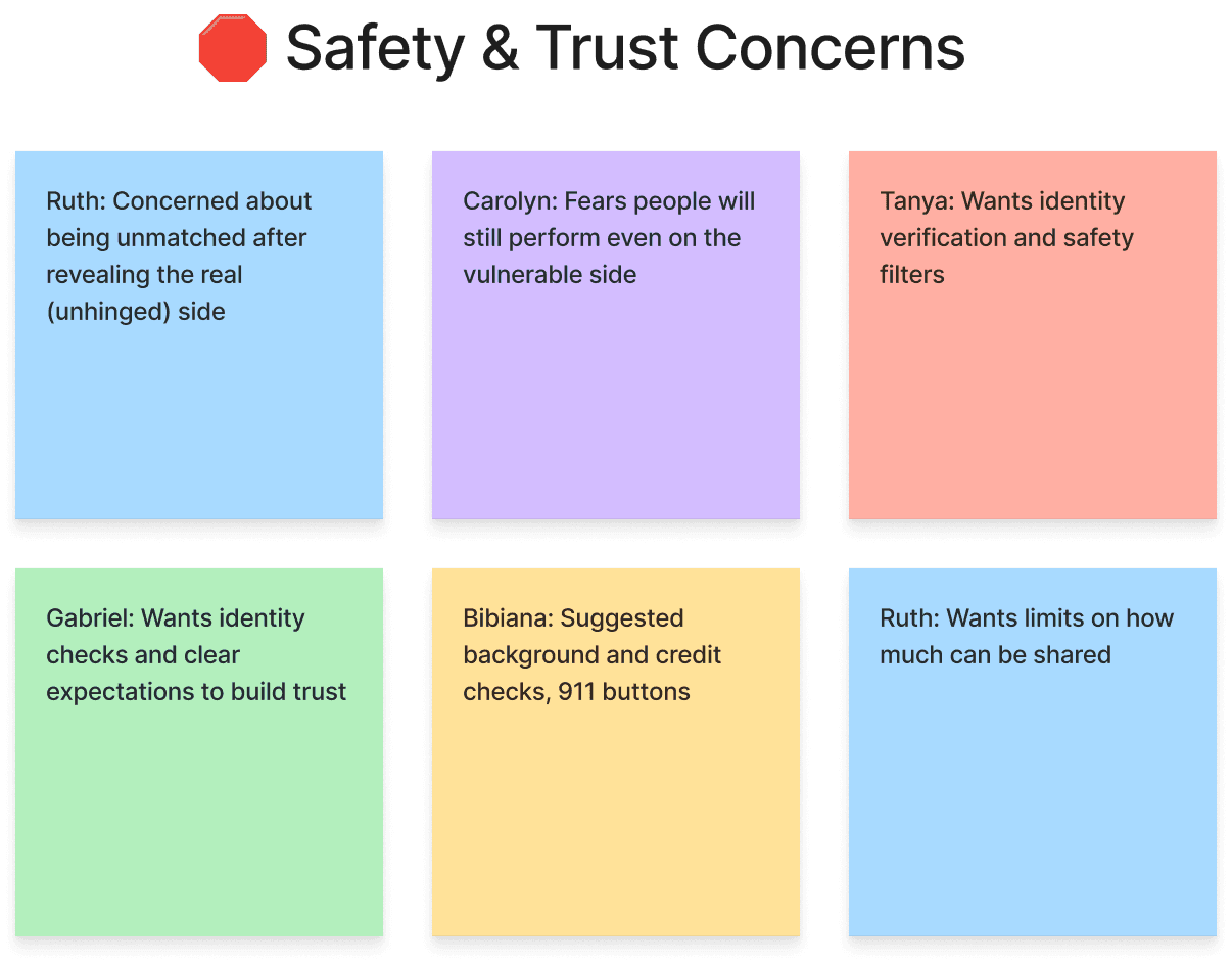
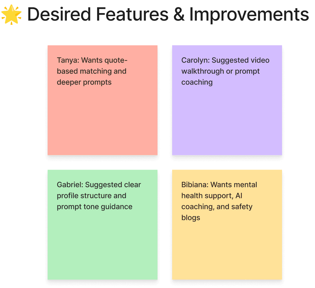
• Stronger safety, privacy, and reporting tools supported by AI driven detection
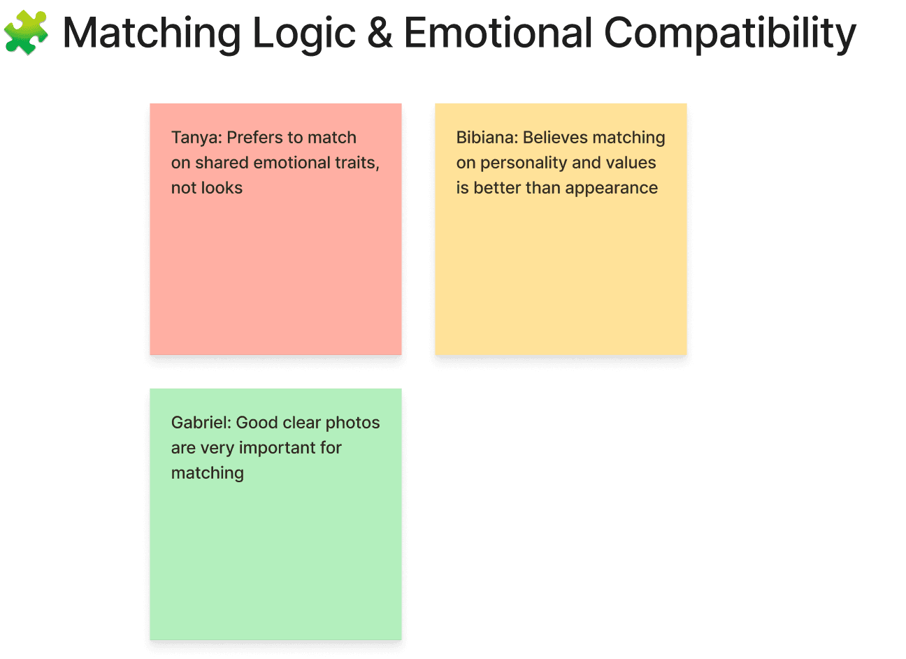
• Smarter matching based on emotional traits and comfort levels
• Better guided prompt selection
• Expanded media options
• Optional emotional intelligence conversation starters
Reflection
What I learned about designing for vulnerability.
This project taught me how pacing, tone, and microcopy shape emotional comfort. Building two profiles made me think deeply about how much vulnerability people are willing to share with strangers. Small details like prompt swapping and clear transitions made a big difference in helping people feel safe, curious, and excited instead of overwhelmed.
I learned that not everyone wants to be unfiltered, and that is okay. The goal was not to force honesty, but to give people choice, comfort, and control. That meant making emotional safety visible and building trust through the small moments.
This project reminded me that trust is not created in a single screen. It comes from the flow as a whole. Each iteration brought us closer to an experience where people felt comfortable being honest and excited to share.
Design Lessons
• Emotional safety must be visible, not implied
• Clarity beats cleverness
• Flexibility supports vulnerability
• Fun and control matter as much as the big idea